A New UI is not needed for Symbian ^3, just make the existing one work
Published by Ewan Spence at 13:08 UTC, July 8th 2010
Summary:
With Nokia and Symbian on the ropes in the tech media at the moment, and with User Interfaces (UIs) a particular battling point, Ewan points out that there's nothing fundamentally wrong with Symbian^3's UI and that every mobile device in the last 20 years hasn't looked appreciably different. The key, he explains is in consistency and user experience within the UI and he points out that this is where recent S60 versions have fallen down. Nokia job advert: "Wanted: Someone with obsessive attention to detail"...
In all the talk of updates to operating systems, changes to code and reworked smartphones, the biggest clamour seems to be that Symbian “needs a new user interface!” I suspect that the majority of people reading this will be nodding their heads at this point.
Let me challenge that notion for a moment, because I've been looking back at various UI's on handheld devices over the years, and you know what? They all pretty much use the same UI paradigm, they all basically work the same way, so what's the fuss about?
To be fair, there are differences. The screen sizes have increased, there are more colours available, keyboards and cursors have been joined by various types of touch screens, but fundamentally they look and work in the same way. Applications are represented by icons, and these are laid out in a grid format on the screen. Popular applications are placed in a tray at the bottom of the display (or in older machines like the Palms and Newton) hard-coded in buttons or strips made by the manufacturers.

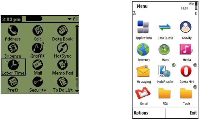
The Pilot 1000 launcher next to the S60 launcher
I'd wager that if you handed one of those older machines to a modern smartphone user, they'd be doing all the regular operations intuitively without worrying about what to do in a very short amount of time. By the same rationale (assuming we had a time machine) if you were to hand a modern device back to the PDA crowd in 1996 (apart from them wondering about the physics of the battery life and screen technology) they'd be just at home with the modern layouts as their historical counterparts.

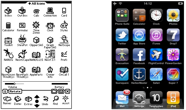
Apple's revolutionary new UI on the Newton, and the same look 15 years later on iOS 4
Getting to the app which has the information you want is key in a mobile device – then and now. While the underlying nature of any computer system is the files and directories, it's very unusual to see a file system on display as the main interface on a consumer device. Although this was the model used on the Psion machines (and to a certain extent Windows Mobile) even those machines had app launchers that could be called up and used the “icon with a name under it” view, and the mainstream machines that had the huge sales and adoption all followed an “app launcher interface”.

Mind you, the UI is not just the program launcher, it's also the buttons, menus, status bars and other on-screen elements, and these have stayed relatively consistent over platforms as well. The main menu sometimes appears as a strip along the top, but in all cases needs an operation to bring it up completely, be it a softkey press, a button marked menu, or a tap on an icon. Dialog boxes now take up the majority of the screen and are commonly 'flat' in that the options are listed sequentially and you can scroll down to alter what is required – a tabbed approach is used when more than one 'page' is needed.
The reason why the UI on the majority of mobile devices has been similar for decades, beyond little flourishes like transparency, scroll speeds and little animations and bounces, is simple. It works.
Over the last few years I don't see the mobile UI paradigm having changed. It's been implemented on a number of platforms from the same starting point – the user – and always ended up in roughly the same place. All the talk of throwing out the UI and starting again is misplaced. What is needed is a consistent UI that does what everyone expects it to do.
This is where the Symbian world has fundamentally fallen down. In its previous incarnations under EPOC (running on hardware from Psion, Diamond, Ericsson, Oregon Scientific and Geofox), there was a laser-like focus on keeping all the elements of the UI exactly the same in every built in application, and this was carried over and upheld by the third party developers. With everything under one roof (hardware, core software packages and the OS) this was relatively simple. [sounds like Apple today! - Ed]
Once Symbian was spun out from Psion, it started by promoting four different UI's that could be placed on hardware running Symbian OS. Some of these never saw the light of day, one was adapted to UIQ, one to Series 80 (the Nokia Communicators), one to 'Series 60' (S60), and manufacturers further tweaked away anything they liked. The UI similarity across Symbian OS had been lost, and I'd argue it's never come back.

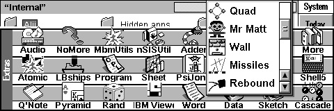
Icons fill the screen, with status indications and soft keys - S80 is just as familiar
Even with the dominance of S60 to the point that S60 and Symbian have in some journalists minds become interchangeable, the differences between the UI on devices means you can't simply switch from one handset to another. The touch interface is different between various firmwares (even when the latest handsets are on the most recent firmware); applications are provided for one set of phones in the range but not another; and I'd even argue that the Nokia practice of moving application icons, settings and options around the system screens depending on the target user of the device diminishes the effectiveness of S60 as a platform (but I realise this is the very thin edge of a digital wedge).
These changes have led to S60 struggling. Not because it is a UI with history, but because those in charge of it have not kept a strict control of what is happening over the device portfolio. Where is the internal champion for S60, the cheerleader who believes that his entire purpose is keeping the UI slim and efficient?
When I hear talk about Symbian needing a new UI, I think that's wrong. What I think is more vital is that Symbian needs a consistent UI. It needs the laser focus to make every application they supply act in the same way. That doesn't restrict what you can and can't do, it's still possible to have a sprawling email application, competent web browser, agenda, world clock or solitaire card games – that's been shown on countless platforms before (and since). What it means is you need to have someone who's entire job is to look at the interface, to have the power to force changes on coders, and who is anal to the point of moving dialog boxes one pixel to the left. Because consistency in the look has to be maintained.
There's also going to be pain. Let's assume that the UI in Symbian^3 has had this microscopic surgery to get consistency across the board. Is it going to look any different to the average reviewer? Probably not – Nokia have already been using the UI in applications such as Nokia Beta Labs Gig Finder, and third parties such as the Tesco Online Ordering application (still in private development at this point in time) are using the ^3 look. I can already see the blog posts and 'expert' comments that will be written about Symbian^3's UI and discounting it because it looks the same as S60 5th Edition and therefore the handsets are sporting something that's old and 'past it'.
Err, see the argument above. Short of a few new colours and some coding to allow for a capacitive screen as opposed to a resistive screen or a key-based cursor selection model, the interface works in exactly the same way as the original Apple Newtons, Palm Pilots and HP 200LX's. It's far easier to write that "the UI is the same old same old" without explaining why this has to be the case because of user expectations.

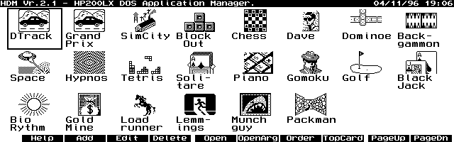
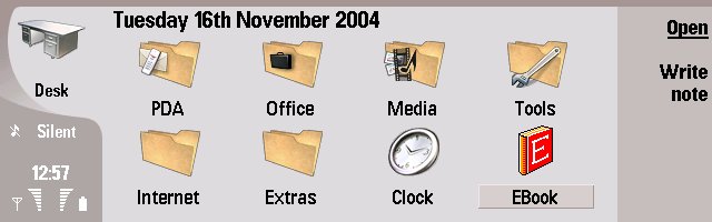
Hewlett Packards HP200LX DOS Palmtop, with a default launcher that looks familiar!
Neither will there be acres written about how a consistent feel has been brought to the UI. One of the biggest bug bears of S60 5th Edition is that some things need one tap, some things need two (one to select, one to act), and different menus and lists work in slightly different ways. Interface is more than the look, it is the feel as well. The same accuracy that needs to be handed to the on-screen elements also needs to be applied to how the users communicate with the devices. Symbian^3 is moving to have 'one-tap' everywhere in the UI, but it's likely to go unnoticed as an improvment.
And all of this needs to be explained in a simple one page document, that is easily and freely available to every single developer, and any application that gets a promotional push in the Ovi Store, that gets highlighted by the various blogs and sites, must follow the style guide.
All the elements of a good UI are already present in Symbian^3. They're also present in the minds of the users. There is a paradigm of how a mobile device should work that's already out there. It's followed by Apple, by Google, by Palm, and others. S60 kind of followed it, but by losing the focus that other mobile platforms had, by changing icon layouts, by being inconsistent, and by burying settings and options in ever more convoluted places, S60 5th Edition felt too much like hard work, if I'm honest.
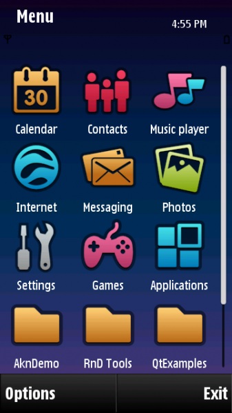
Symbian^3 UI - another in the long line of familiar looking UI's
In terms of Symbian's UI, the answer is not to re-invent the wheel, the answer is to repair the punctures in the wheel so it can be re-inflated back to its proper shape. The tiny flaws in the S60 UI are magnified because they are seen in every operation. Once those are repaired, then everything will run smoothly again, and the UI will move back to something that is not noticed or commented on.
If nobody talks about the UI in Symbian^3, then it will be doing its job properly.
-- Ewan Spence, July 2010.
Discussion
Dubito
That is probably the single most sensible article ever written about mobile device interfaces.
The "single/double tap" problem is so baffling that when I heard about S^3 being "single tap everywhere" I had no idea how that was different from the status quo - until I got a chance to play with an N97 mini and discovered the double-tap rubbish, and couldn't believe anybody had ever coded it, and that anybody else had ever signed off on it.
I think the debate we still have to have is about home screens - I love the information richness and utility of the traditional S60 screen, and see Android as being a dumbed-down version, and 5th Edition as being a differently dumbed down version. I may be wrong, but iPhone doesn't seem to have a "home screen" at all.
I've seen people complain about the way 5th Edition "lets you clutter up your home screen with widgets, but at least the menu is still available", which is a WTF moment if ever I read one.
Having said that: Android is prettier than S^3. Until you add enough widgets and shortcuts to be useful.
Unregistered
I've recently got Android after some years on Symbian and 6 months on iPhone.
The Android is a let down, no great advance on S60 5th edition even.
As for double-tap on S60, how stupid does a person need to be to have a problem with this? Any intelligent human adapts within seconds. I never even noticed it until people mentioned it.
And as for Symbian^3, I'll start listening to peoples opinions when they've actually used the finished release. Until then, everything with a pinch of salt.
Dazzy
I have to agree with this article.
I was testing Android 2.1 and Sense UI out last week for a few days on a friends HTC Legion and to be honest they way I have my Vivaz set up there isn’t much difference.
If you're a Google addict then maybe it's better at syncing with Google calendars than Symbian, or is it? Having listening to the last PSC, and heard the mention of GoogaSync I looked it out. Guess what it syncs calendars (and multiple calendars Tim) just fine. My only gripe is it doesn't do tasks. But the truth is I am 29 years old, my brain works fine and I have very little need to put everything down on a calendar, as I simply remember what I have to do! So will I buy this app? Probably to support the developer but I doubt I will use Calendars much.
Yes I use Gmail and all my email accounts go through it, but for the amount I actually email on the phone setting it up in the default Symbian mail application works just fine, and then keep an active data connection. alas Push Email. I might try Profimail some day but as of now I am happy with this element, as I do agree with a comment made (Ewan I think) that where possible its better to use the default tools rather than adding another layer.
SPB Mobile Shell for the UI, have been using this since the early betas on my Vivaz and it truly does make Symbian devices UI very easy to use, some exciting things coming in the future for this as well.
MS gives me a very nice interface to look at whatever agenda items I do have and once they add the 3D message/Mail viewers I will have little need to use the default UI when viewing a message.
I use my phone to store long customer numbers, passwords etc and this is taking care of very well by SPB Wallet. (getting harder to remember numbers lol)
I use Gravity as my Twitter client, Google News reader etc. Some improvements can be made here, such as the Facebook client and maybe media in the Google reader, but will have to see what Janole comes up with.
Just recently put Sports Tracker on and it works fine, no need know to carry the ipod touch when I am out running as the phone will do it all, one less thing to carry so all is good :) Walk to work every morning and never realised it was 2.35 miles till I traced it yesterday in ST lol.
Use Google maps if I am away and need to find somewhere, and it works fine, just think OVI Maps would be better here, but does the job.
My only real gripe about my Vivaz at the moment is the bugs in the firmware that SE doesn’t seem to want to know about. I will bide my time before deciding on which Nokia device to buy next now and leave any decision till 2011.
I am about to switch the new One Plan from 3UK so that will solve my Voicemail problems due to SE disabling the call recorder apis in Symbian and such apps then don’t work.
I use various other apps on the phone but one thing I am on the lookout for is a good way to hide messages and emails, whether pass word protected or what, any suggestions?
Unregistered
i guess people are tired of looking at the old icons. if they changed the icons maybe people would say, " this is different." Transition effects on s60 5th edition is somewhat sloppy compared to iphone or android. they made the device sluggish and somewhat inconsistent. people would want it different not just on hardware but also in interface. the icons are reminiscent of the s^1, which i think for some who would want to move on should be changed. they want to forgive and forget but when they are presented with something that is nostalgic of the past, some maybe forced to go sideways.
Cheers for N8!!!
Unregistered
I agree with the above. It seems like people has have become visual oriented when it comes to UI. These fancy icons and transitions are unfortunately at this time the most important thing to the common consumer. We may blame apple for it but it really goes way back. Now, more than ever gadgets have become a fashion item. (much like those toy dogs) And it needs to look good and dare I say it "cute". But that is not the case though with us reading these tech blogs, we mostly want high specs and functionality. But honestly, I wouldn't mind if it looks good :) . I remember buying those Nokia phones in the late 90's because the had interchangeable colored faceplates ;p
Hardeep1singh
S60 has had the option of changing the menu view eversince the N95 but the sad part is we never received any menu view plugins. Nokia did experiment initially with horse shoe menu etc but then forgot about it, the option itself is still there even on S60v5. They should've pushed out multiple menu types atleast that would've given some options for people to try.
Unregistered
i don't think a total overhaul of symbian's UI is essential, how the UI "FUNCTIONS" works for me just fine. But what i hate is how the UI "LOOKS" it needs to be fine tuned to make it look every bit desirable...
case in example... the font-icon ratio/size (if there's such thing) on most symbian devices are HUGE and wastes a lot of space all over. Try to compare the size of the icon and the size of the text (app name) on the main menu of symbian VS iphoneOS/iOS4 (or whatever they're calling it now). the text and icons in symbian are wasting a lot of real screen real estate whereas the latter had every bit of screen display the aligned and occupied neatly...
another area where i hate symbian's huge font is the music player... instead of offering us as much info possible. Like, i have entitled "You Give Me Something" and all that gets displayed on the screen is something like "You Give Me Som..".
little things like font tweaks, nice looking icons, animated backgrounds AND wallpaper, smooth transition effects, etc. will give symbian that much need breath of fresh air...
Unregistered
heck! i even think that S40's UI and how it works is much better and much improved over the couple of years than on S60/Symbian...
Unregistered
SIMPLE FACT OF THE MATTER: Symbian^3's UI is now EASILY as good as the latest iPhones and Androids. No question. Someone may prefer one over the other of course, but that's purely personal taste. No longer can anyone say Symbian's UI is crap or uncompetitive.
Now, given that, you then have to compare on OS quality and engineering - Symbian wins by a mile being far more mature, efficient and well engineered and designed than Android or iPhone.
And you have to compare on hardware. Well, looking at the N8 it's not really worth making a comparison - the hardware and featureset of the N8 is so far in advance of anything else out there (if you're comparing processor speeds you don't understand how to compare, and as for screen res, yes N8 has lower than some but touchscreens are all the same physical size more or less, so how are you going to see those tiny invisible pixels on iPhone 4 anyway? Text is so small you have to zoom in too, so N8's lower res makes no practical difference).
Finally, you have to compare on apps. Yep, iPhone and Android do have better choice (I don't think better quality) but this is changing, and will continue to change, rapidly.
After seriously investigating the latest iPhone 4, Androids and the N8, the N8 will be my next phone. For me it wins by a long way.
Unregistered
Seems that it is not enough to be fully customisable and theme-able as S60 is.
Font size is controllable in themes. As are icon designs.
Unregistered
I agree that the whole UI VIEW is not revolutionized during these years.
yes, the iconic grid layout of main menu/homescreen has not changed.
iOS/Android/Meego shine in other part of the UI ecosystem.
The whole subsystems should be considered when a UI is technically discussesd. to name a few:
User interaction with commands (S60 old Option menu style or iOS on screen widgets?, ...)
notifications to the users
shortcuts
displaying data which can to be fitted to the screen (scroll bars, combobox, listbox, ... ex compare old style WinCE/WinMo scrollbars with kinetic scrolling)
...
One the most important parts of a UI system (which is completely hidden from endusers) is the code behind it. The biggest evil hidden inside S60 is Avkon. This old, sluggish, complicated GUI subsystem is a complete mess.
Symbian.org and Nokia finally accept their weakness (but it was too late) and decide to replace it with Qt (S^4)
The problem with S^3 is not the VIEW section (as you mostly point in your article), merging Qt into symbian underlying system is not that easy. it takes time.
The 3rd party application developers need to migrate to Qt framework and rewrite their applications, and this process is not fast either.
Another problem of S^3 is it is not a neat OS, it's just a bridge between S60v5 and S^4. combining Avkon and Qt means two ecosystems on the same platform which ends in more RAM/resource requirements and cluttered experience. This only suit to developers who want to adopt from Avkon to Qt.
Nokia should respond much quicker. market-wise, S^3 is already about a full year behind the competition right now, S^3 has never shown any thing special and endusers have not any specific reason to choose the S^3. The only reason to pick a S^3 phone is a decent hardware like N8 (not the OS itself).
I hope nokia move to S^4 asap and abandon S^3 as they did with S^2.
iFanboy
"SIMPLE FACT OF THE MATTER: Symbian^3's UI is now EASILY as good as the latest iPhones and Androids. No question."
You're kidding, right? Try asking your mum or dad (Or hell, wife if you have one) to place a call on Symbian^3 (Whatever the hell that arrow is meant to mean anyway?) and then ask them to do the same thing on the iPhone and see which one is easier/more pleasing for them :-)
"Now, given that, you then have to compare on OS quality and engineering - Symbian wins by a mile being far more mature, efficient and well engineered and designed than Android or iPhone."
Efficient? and you know Symbian is more efficient how? all those hours you've used it? Wow what blatant fanboyism :-/
"And you have to compare on hardware."
Yes, lets.
"Well, looking at the N8 it's not really worth making a comparison"
You're kidding again, right? iPhone 4 with it's retina display, 32gb internal memory, A4 processor, 512mb RAM and Camera Optics are easily on par or better than Nokias N8, all Nokia are doing are KEEPING UP, not surpassing ;-)
"the hardware and featureset of the N8 is so far in advance of anything else out there (if you're comparing processor speeds you don't understand how to compare, and as for screen res, yes N8 has lower than some but touchscreens are all the same physical size more or less, so how are you going to see those tiny invisible pixels on iPhone 4 anyway? Text is so small you have to zoom in too, so N8's lower res makes no practical difference)."
You say if people compare Proc speeds they don't know how to compare then go on to say screen resolution means nothing?? Take some of your own advice my friend. I can honestly say right now confidently that you have never, ever laid your eyes on the new iPhone 4's Retina display. all those 320PPI are absolutely JAW DROPPING and it makes SO MUCH difference even on the tiny display it's unreal :-/ Try it, THEN comment about it, until then, quit spouting rubbish as if it's fact.
"Finally, you have to compare on apps. Yep, iPhone and Android do have better choice (I don't think better quality) but this is changing, and will continue to change, rapidly."
Clearly.........CLEARLY you haven't owned or tried an iPhone (Again, can't speak for android as i've never tried it)
the apps are CLEARLY better. There is literally (To use the phrase) an app for everything. And don't even get me started on games, does ANY Symbian phone have a FULLY 3D MMO for thier phone? The APPS are 100 times better than anything Symbian has to offer.
"After seriously investigating the latest iPhone 4, Androids and the N8, the N8 will be my next phone. For me it wins by a long way."
I highly doubt you've "Seriously investigated" any other phone other than the N8, which is fine, just don't spout rubbish as if it's the truth :-)
Mr Mark
Great article. Hits the nail squarely on the head - the problem isn't with the core UI, it's with the way it's been implemented. Consistency and ease of use are king and that only seems to be dawning on Nokia now.
iFanboy
By the way, until this article I never realised how similar Apple's and Symbians app launchers are, take away the home screen on Symbian (Or put one on the lock screen on an iOS device) and what you essentially have are the same things. Just apple tends to go horizontally and Symbian vertically :-).
Oh and here's the difference between an iPhone 3GS's screen (Mine) and my cousins iPhone 4, tried to show this as best I can but it's much better in person, the resolution difference should be most apparent: (Hope this works lol)
3GS
iPhone 4:

UnregAli
@Ifanboy
One year ago as Iphone 3gs introduced, i say to my brother (who is also an Iphone user): Look at the Screen Resolution it is lower then Nokia 5800 and other Symbian Devices. His answer was: Don't count to the spec sheets, IPhone 3gs display is far better then anything else.
Now Iphone 4 is released and you say: Look at the screen resolution. :-)))))
PS: Sorry of my english.
iFanboy
Well that didn't work, hopefully this link will work for the iPhone 4 image:
<http://profile.imageshack.us/user/IainsTheName/images/detail/#697/imageqwl.jpg>
iFanboy
Quote:
Originally Posted by UnregAli
@Ifanboy
One year ago as Iphone 3gs introduced, i say to my brother (who is also an Iphone user): Look at the Screen Resolution it is lower then Nokia 5800 and other Symbian Devices. His answer was: Don't count to the spec sheets, IPhone 3gs display is far better then anything else.
Now Iphone 4 is released and you say: Look at the screen resolution. :-)))))
PS: Sorry of my english.
|
I bet your English is a lot better than my version of the language you speak :-)
However, you go on to say that something your brother said, was something I said? I've never said the 3GS has a better screen than the 5800 Ali ;-). However I will say that whilst the 5800 has a sharper image, the 3GS does have better colours, outdoor readability and use case for me thanks to the tech it uses and it's capacitive screen :-).
However I will go on record and state that the iPhone 4 has the best damn screen I have ever seen on a mobile device to date, and I hope other Manufacturers start to copy, as that'll only make Apple innovate quicker :-)
Solnyshok
UI is not only about "how it looks" but also about "how it feels". And by this, I mean that 600Mhz Omnia HD (S60v5) takes 1-2 seconds after each letter to filter contacts in my address book (ca.1000 contacts). C'mon people, use RAM caching for christ's sake, make device fly. SPB can do it, time for Symbian to get rid of such abrupt stops in the UI ride.
Jejoma
Quote:
Originally Posted by iFanboy
. . . the apps are CLEARLY better. There is literally (To use the phrase) an app for everything. And don't even get me started on games, does ANY Symbian phone have a FULLY 3D MMO for thier phone? The APPS are 100 times better than anything Symbian has to offer.
|
What a rant :)
But seriously, Symbian is catching up with the iPhone on the app / interphase front. I've just downloaded Rotary Dialer to my i8910 from OviStore. The ultimate dialling interphase - it should be standard on all mobile phones. I'm sure the iPhone had it first but as I said, Symbian's catching up fast.
UnregAli
@IFanboy I just give my brother as an example. Many Apple fans dont count on specs if the IPhone is not better in tihs sepfication. If IPhone in a Statistic or in a Spefication (like screen resolution) any better all fanboys screams that out.
jonquirk
I came to S60 after a run of Palm devices (Pilot, m500, Tungsten|T2 and Tungsten|E2) when the hardware reliability issues, and charging on the E2 in particular, became too much to bear.
I went for the E61i and was struck by how little information was on that 2.8" screen compared to the Palm devices.
Once Palm added the D-pad they became very versatile devices that could be operated purely as touch screen or almost totally one-handedly with the D-pad: really the best of both worlds.
Symbian needs someone to take charge of the UI in the way that Palm had a "tap Nazi" whose job was to enforce a way of doing each operation with the least number of taps on screen and find a way cough* copy cough* Palm's PIM apps to get more on each screen.
Failing that just get Janole to extend Gravity to run the whole phone and have done with it!
froschy
Good article Ewan, I think you're spot on with Symbian needing a focus on the UI consistency but I would also add that it needs some tweaks in areas like the notifications system, etc... (maybe this will be addressed in S^3 or S^4) and also attention on the design aesthetics of the UI (icons, fonts, button desin, etc...).
Apple and Google are much better at this aesthetic and understand the value for marketing their devices, I just don't think Nokia understands this.
Unregistered
I understand the the iPhone 4 has a very high res display, and I've looked at one and its very nice, but I can't see any benefit of the higher resolution over the old iPhones. I can read everything on the old one. What's the advantage? Can't see tiny pixels? Great, but so what?
Emperors new clothes. Again. These phone makers (all of them) should put their efforts into real useful enhancements instead of chasing high spec numbers to seduce increasingly gullible and stupid consumers.
Unregistered
This is a very well written article that points out exactly what needs doing (On the UI front) if Symbian is to "come back from the dead".
I think it speaks volumes that I've 2 Symbian devices over the last 2 and a half year (s60v3 and s60v5) and I've only just discovered the organise feature to make the menu system work how I want it to. Why was the organise icon not present in the settings menu item where I'd expect it to be?
If these features were better advertised or a little easier to get to I'd have realised that it's possible for me to have a logical icon based user interface on my s60v5 device much earlier than a year into usage!
I honestly believe that with some under the hood work on Symbian to improve it's memory print, fluidity and speed, Symbian would be very competitive, there are only a few tweaks needed to the UI to make it consistent the whole way through.
gadget freak
I could bore you all with all the smartphones and pda's i've owned but surffice to say i've been buying them since the xda, p800 etc and the Htc Desire is truly a amazing device there is nothing on symbian that comes close and i've seen nothing in the N8 so far to make me think different.
Now thats not to says the Desire is perfect, battery life is mediocre and the PIMS are dreadfull.
Forget fancy icons symbian 3 & 4 need to just make it easy to set the device up in the first place s60 was way too complicated. ( though not as bad as UIQ what a shambles)
Full thread: 58 Comments / Post New Comment