Having been trying to access YouTube via clients like CuteTube recently, I'd been very frustrated that a lot of the videos found couldn't be played because of 'access restrictions' - perhaps YouTube is cutting down on videos access via APIs because of the number of 'illegal' downloader utilities?
In any case, I'd become familiar with the m.youtube.com interface presented to Symbian owners via Web and then, overnight, the interface changed. The new one presents the wealth of 'signed in' YouTube options in a long scrolling pop-up side pane and there are fewer fiddly icons that are hard to hit. There's a full walkthrough below, but let's start with YouTube's interface on Windows Phone (on the Lumia 710 here), on Symbian (on the 808 here) and Android (the giant screened Galaxy Nexus here). Identical:
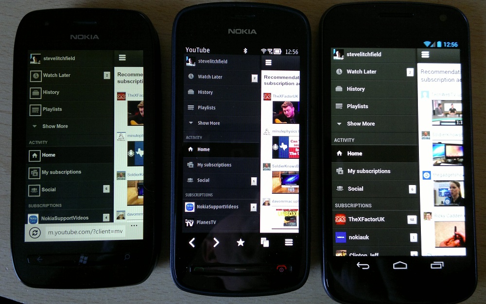
Interestingly, there does seem to (shock, horror) have been some testing by Google of the new interface on Symbian handsets, i.e. using the default web browser, since Opera Mobile on Symbian still gets served up the old 'lowest common denominator' interface. So well done Google's YouTube team.
Starting at the beginning(!), here's a complete walkthrough of the new interface. Logging into YouTube in Web on Symbian now gives:

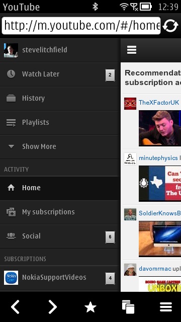
The big change is the switch of all the extra functions to the pop-up panel - you tap on the = icon and the main content slides to the right, with the dark panel appearing. It's quite scrollable and quite long, so I've also pasted it together below, as you'll see.
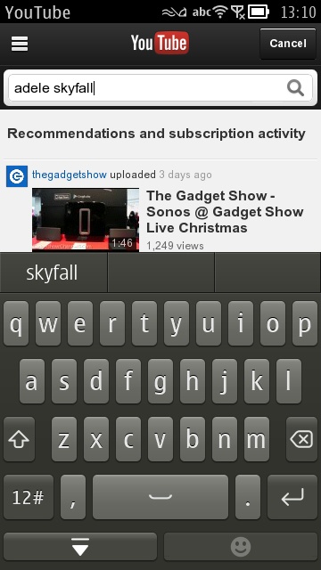
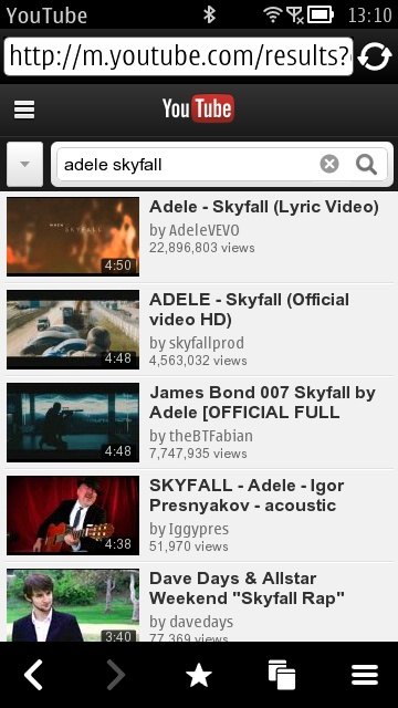
Also of note is that the magnifying glass 'find' icon is bigger and easier to hit. And hitting 'Enter' on a virtual or physical keyboard is enough to kick off the search. The 'v' pick list icon besides the search field pops down extra search filters, by the way.
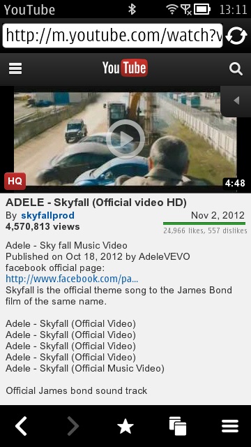
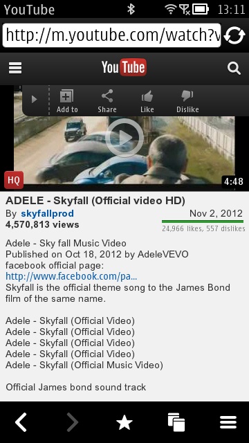
As before, the '<' icon pops out a 'social' panel, for sharing a video or liking it.
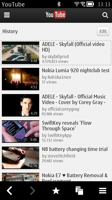
 Tapping on the = icon pops across the new side panel shown down the left hand side below. I've highlighted just a few features from this. Note that your complete YouTube browsing history is available, should you want to check back on something:
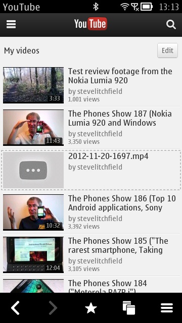
'Favourites' and 'Likes' are obvious. 'Uploads', as it sounds, provides a quick way into all the videos you've shared with the world:
And then we're into your YouTube subscriptions, tap any of them to bring up their latest videos:

Sometimes it's best to sacrifice the immediacy of a dedicated client application for the authentic functions of the actual site or service. There's so much in YouTube these days that using this new HTML5 web interface makes a huge amount of sense.
I haven't mentioned much about actual video playback yet - this works much as it did before, except that video quality can now be toggled by tapping on the red 'HQ' flag at the bottom left of a video's playback thumbnail. The default is 360p or 480p, depending, I think, on the source material - tapping on the 'HQ' flag turns it grey and then a low resolution 240p stream is served up. The only occasions you might want to do this might be when mobile and on a slow connection, I think. 360p video looks perfectly crisp on the nHD screens of the current Symbian generation, of course, since nHD is 640x360, so the vertical dimensions match exactly.
In short, I just got myself a new favourite way of browsing, interacting and watching videos on YouTube. Comments welcome if you have opinions on this new interface.
