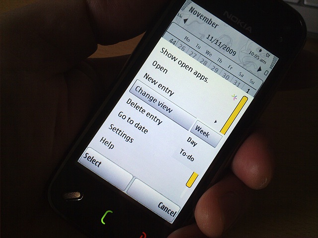
"All of which is not to defend every decision made by the S60 user interface teams over the last few years. The v20 update, with its kinetic scrolling in every menu, dialog and pane, is clearly a whole heap more intuitive than the 'scrollbar' driven system still used today on the Nokia 5800. And some of the application interfaces are downright disjointed - for example the Options/Actions split in both Web and the Camera apps. But the end result is something which is still very usable - if not perfect. There's simply too much heritage and too much functions to radically overhaul the UI without throwing things away. I'm guessing that Symbian^4 in a year or so's time will be the point where there's a whole new interface and hoping that not too much of the existing functionality gets ditched"
Nokia N97/N97 mini: part 2 - The OS, The Interface, The Apps
Published by Steve Litchfield at
In part 1 of this review mini-series, I looked at the form factor, design, build quality and performance of the Nokia N97 and N97 mini, concluding that the mini was the more streamlined product of the two, with another six months of design behind it. In this second part, I look at the OS, interface and applications. Can the N97 and N97 mini hold their heads up in 2009?
