Review: Nokia N97/N97 mini: part 2 - The OS, The Interface, The Apps
In part 1 of this review mini-series, I looked at the form factor, design, build quality and performance of the Nokia N97 and N97 mini, concluding that the mini was the more streamlined product of the two, with another six months of design behind it. In this second part, I look at the OS, interface and applications. Can the N97 and N97 mini hold their heads up in 2009?
S60 5th Edition
Having deliberately drawn a veil over the Nokia N97's software prior to the big v20 firmware update*, it's still important to at least acknowledge those early adopters burned by living through the first few months of N97 ownership using an interface that was unduly clumsy. Some people contend that, even with the v20 update (built-into the N97 mini from day one), S60 5th Edition still has a long way to go before it can even hope to match the likes of Apple's iPhone in terms of usability. And they've got a point. S60 5th Edition is, at heart, the mature S60 3rd Edition interface adapted to larger displays and touch screens. So instead of a fairly 'flat' menuing system we have dozens of functions still nested on 'Options' menus in addition to finger-friendly common-action buttons.
* still not rolled out to all devices, it seems, especially those branded by networks around the world...
The thing is that part of the need for traditional menus is that there are far more functions (and sub-functions) than could be assigned to icons and buttons in a 'flat' interface. The iPhone, Android and other mobile OS are hitting the same problems as they grow and add functionality. In some cases, they solve the problem by relying on third party apps to take the strain, providing functionality that's built into every S60/Symbian device.
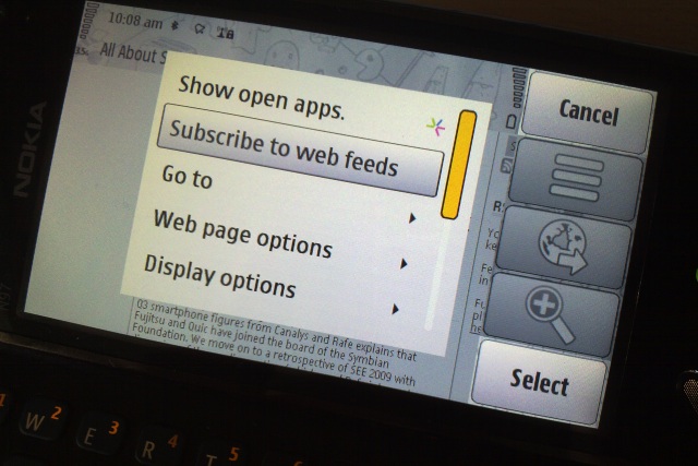
All of which is not to defend every decision made by the S60 user interface teams over the last few years. The v20 update, with its kinetic scrolling in every menu, dialog and pane, is clearly a whole heap more intuitive than the 'scrollbar' driven system still used today on the Nokia 5800. And some of the application interfaces are downright disjointed - for example the Options/Actions split in both Web and the Camera apps. But the end result is something which is still very usable - if not perfect. There's simply too much heritage and too much functions to radically overhaul the UI without throwing things away. I'm guessing that Symbian^4 in a year or so's time will be the point where there's a whole new interface and hoping that not too much of the existing functionality gets ditched.
The worst example of interface inelegance. Web, showing both a pop-up menu and a traditional Options menu...
The N97 (v20) and N97 mini, shipped
And so we have the Nokia N97 and N97 mini as commercial, shipping products, being bought in the High Street in decent numbers (approaching two and a half million worldwide), flagship phones as far as most buyers are concerned. There have been rumours of numbers of N97s which have been returned, though exact stats aren't available. Remembering that we're only considering the N97 with v20 firmware and the N97 mini here, the relative shortage of RAM is only going to be an issue to hard core users. The built-in applications are fairly RAM efficient and, without 3rd party apps, the man in the street will have to work fairly hard to hit the buffers. Geeks will rightly complain that they wish the N97s had more RAM to start with (along the lines of the non-Symbian N900), and they're absolutely right to do so - but we're stuck with 50MB or so free RAM after booting.
In daily use, I don't believe that RAM is much of an issue. Maybe I browse lighter web sites than others, maybe I run a different set of third party apps, maybe my music collection is smaller - for whatever reason, it's rare for applications to get closed without warning. (The third party star Gravity has been problematic for many, but I believe the developer is about to release a version which is far more frugal with RAM.)
Homescreen
As ever, S60's interface revolves around the dual tenets of a homescreen, in this case one with five customisable slots for widgets (several of which have multiple actions and assignments), and a traditional application shortcuts grid. Both tenets deserve comment here, especially in the light of 2009 expectations.
Nokia's widgetised homescreen, lifted (as far as I can gather) from Symbian^2 (along with much of the memory model, and another example of how S60 is going to fairly seamlessly meld into 'Symbian'), has been widely praised and for good reason. It's simple enough for everyone to understand, there's little to go wrong and yet it's relatively powerful. The slots available may look limited compared to the multiple scene, multiple page freeform system that HTC have envisioned for their Hero's Sense skin (on top of Android), but they do the job nicely for most people.
As shown, I tend to run my N97 mini with two application shortcut widgets (i.e. 8 apps just one tap away), Music player (in the absence of hardware media controls, this is the best that can be done for the likes of the N97), Calendar (showing up to three upcoming appointments and/or to-dos), and my four 'Favourite contacts'. With extra application shortcuts assigned automatically to the clock, to the Profile display and date, there's a lot of accessibility on offer. The legacy 'Options' menu looks a little redundant, as does the assignment of a 'right hand function key', but at least this mimics what a user would find on an older S60 phone and provides a degree of familiarity.
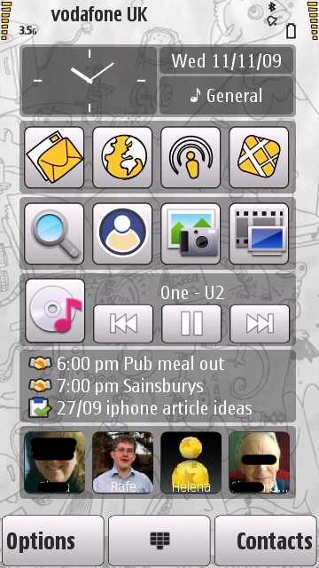
When first turned on, the N97 has Facebook and Accuweather widgets set in place and these are RAM-hungry, not to mention data-hungry, and I can't help think that it would be friendlier for a brand new user to have a set of widgets that didn't try to go online immediately and which didn't take up over 20% of free RAM between them. The N97 mini has just Facebook, which I suppose is a step in the right direction.
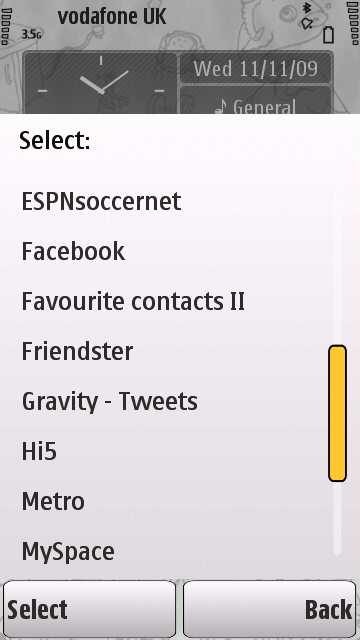
Adding homescreen widgets is easy enough, there are certainly enough pre-configured items to choose from on the N97 mini, though the 'Download content' link is misleading - I'd expect this to go to a dedicated sub-section of the Ovi Store - instead users get thrust into the store's front page and it's up to them to somehow stumble upon content which happens to be homescreen-widget-compatible. A missed opportunity.
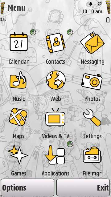
Application menus
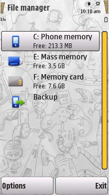
Pressing the main Menu/Apps/home key again gives the familiar S60 grid of 12 applications. It's easy to dismiss this as boring, but in fairness there's no better way to display application shortcuts - even the iPhone uses a similar grid - and Android and Windows Mobile are largely stuck with a single linear, huge, alphabetic scrolling list of applications, which can get painful once you start really kitting a device out. S60 application menus have always been customisable and it's easy enough here to use 'Options|Organise' to shuffle shortcuts into sub-folders (or back into the 'root' folder) in order to create the grid that matches what you want to see. So, for example, I always bring File manager up to root level and I always make a new folder called Games. That sort of thing. The system works well and I'm not sure how it could really be improved.
Within each application, the usual screen furniture of lists (e.g. of contacts) and menu items are all draggable ('kinetically') or you can use the legacy scrollbar handle instead (useful if a list is quite long, since the scrollbar handle can be dragged much more quickly than the items themselves). Again, S60 is rarely beautiful in this regard, but I'd argue it's eminently useable.
The one sticking point is the screen layout in landscape mode (i.e. with the N97/N97 mini turned onto its left side or with the keyboard slid open). The 'soft keys' are overly large and I'd really expected Symbian/Nokia/S60 to have tweaked their sizes by now. The result is that 25% or so of screen real estate is often wasted in landscape mode. At least Web has the sense to auto-hide the right hand side toolbar when not needed. I'd have thought that most applications could benefit from a similar system.
Screen size and touch
Finally, the topics of screen size and touch need to be addressed. Before the Nokia 5800 (and discounting evolutionary oddities such as the 7710 and E90), the largest screen on a S60 phone was 2.8", in traditional 4:3 aspect ratio. Moving to a 3.2" screen on the N97 mini and a 3.5" screen on the N97, both with 16:9 aspect ratio (i.e. 'widescreen', good for web pages and video playing!) and with higher native resolution has the dual benefit of content being generally easier to read (since there's physically more screen real estate) and being able to display more content at once - though this of course does rather butt up against the first benefit at times! Still, bigger is generally better. The N97's 3.5" screen does imply a larger frame for the phone itself and I'd consider this to be about as large as I'd like to see a phone get.
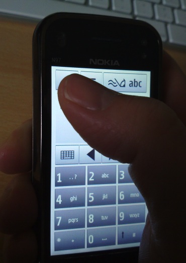
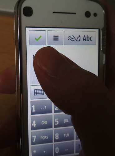
In fact, there are advantages to the smaller 3.2" screen of the N97 mini beyond the obvious one of a physically smaller device. When considering a full-face interface that's driven by touch, in this case by a user's thumb (with the fingers cradling the main body), it's important to consider if the tip of the thumb can reach all parts of the screen. If not, then any UI elements beyond the thumb's range obviously can't be selected. Bizarrely, the designer of the S60 5th Edition touch 'virtual keypad' chose to put the green 'tick' button at the top-left of the interface - fine for left handers but a real stretch for right handers using the N97 - which is where the smaller screen helps out a little.
The issue of whether a 2009 phone should use touch at all is something of a religious/personal one. On the plus side, most of the competition now use touchscreens, and touch is usually faster at any given operation (e.g. selecting things, tapping on icons) in a stable, controlled environment. Touch is certainly more intuitive for almost everything, since you can just point to the thing you want to activate/action/select. It's telling that after using a S60 touch phone for a few days, it's unnerving to go back to a non-touch phone and find oneself prodding the display hopefully before realising....!
On the minus side, touchscreen phones are more fragile, with easily-damaged displays (my N97 already has three large and annoying scratches), they're harder to operate one-handed (even on the smaller N97 mini) and they're harder to operate on the move (think bus/train/car jolting your finger around - under such circumstances it's hard to tap or drag accurately).
Prevailing wisdom in 2009 is that the benefits of touch outweigh the disadvantages, though the winds of fashion have blown in each direction over the last 15 years. A balanced observer would probably muse that there's room for both types of interface, depending on the use case.
Applications
In terms of actual applications, there are very few differences to the quota and feature set of any recent S60 3rd Edition Feature Pack 2 smartphone. I'll be covering the all-important N97/N97 mini media applications (including Camera) in the next review part, but for now, a few notes will suffice (most comparisons are to the familiar S60 3rd Edition versions, and note that the 5800 and other 5th Edition phones have most of this as well):
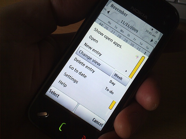
- Calendar gains a split screen month view, to make use of the extra screen real estate
- Contacts gains a summary screen for each contact, with quick links for calling, messaging or emailing
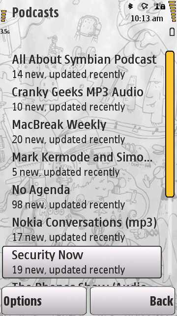
- There's no Internet Radio (still. A crying shame), but Podcasting's alive and well
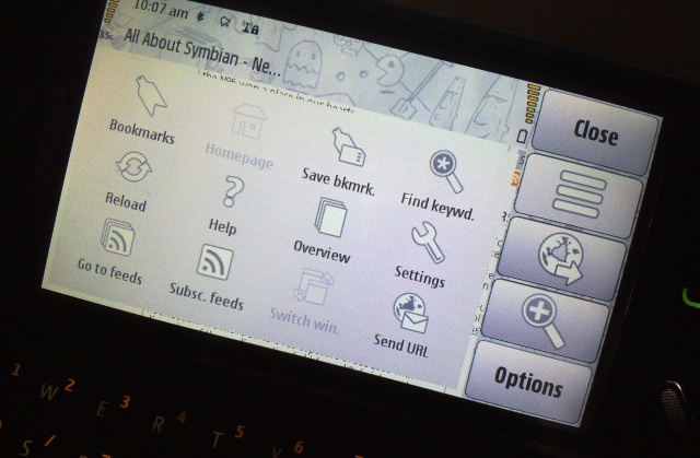
- Web is the new v7 build - it's faster and more capable and every page is automatically shown full-screen once the main code has been rendered
- Photos is the full Nseries build, complete with editing facilities
- Maps is the new v3.1 and makes good use of the digital compass when zoomed in (though this is still frustrating to calibrate, requiring a silly sequence of swivelling and gyrating) - detailed discussion of Ovi Maps is beyond the scope of this review (but see previous articles like this one for more on it). GPS sensitivity is superb on the N97 mini, but arguably borderline on the N97*, making the latter unreliable for navigation. Bizarrely, with the new PR 2.0 software, 'Satellite status' isn't available until a lock is obtained, taking away half the 'fun' of looking for a decent fix(!)
* And this is with the original GPS antenna replaced with the new 'shielded' design, which improved reception by between 2 and 4dB, raising GPS signal from the depths of unusability to 'OK for occasional use'
- Settings is the new, reorganised version that debuted for S60 5th Edition. Most items are easier to find now than in older S60 3rd Edition phones, but the hiding of Sync and 'Phone switch' under 'Settings | Connectivity | Data transfer' is downright unfriendly, especially as each utility is used often in this household.
- As an Nseries phone, the version of Quickoffice is the viewer version, and an old one at that, v4.2. Still, the equivalent (Office 2007) version of v6 Premier is only a free upgrade away. This does use up the best part of 10MB of your C: disk though, so what is a no-brainer install on the N97 mini is a problematic operation on the space-challenged N97.
- On the N97 mini, there's an extra sprinkling of widgets, most of which also have homescreen 'mini' versions, as shown above and below. Most of these are also in the Ovi Store for general download, but it's good to see them here, to get new users off to a healthy start.
- 'Sw update' provides an on-demand check of firmware and application update availability, with the usual suspects: Ovi Contacts (on the N97), Nokia Messaging, N-Gage and Mail for Exchange all being applications that aren't in the firmware and have to be manually grabbed and updated. As with Quickoffice, these add-ons can be a problem on the N97 because they all have to be installed to disk C: and it's easy to start running out of room - no such problems on the N97 mini.
(on the N97 mini, of course, with the larger disk C and smaller mass memory)
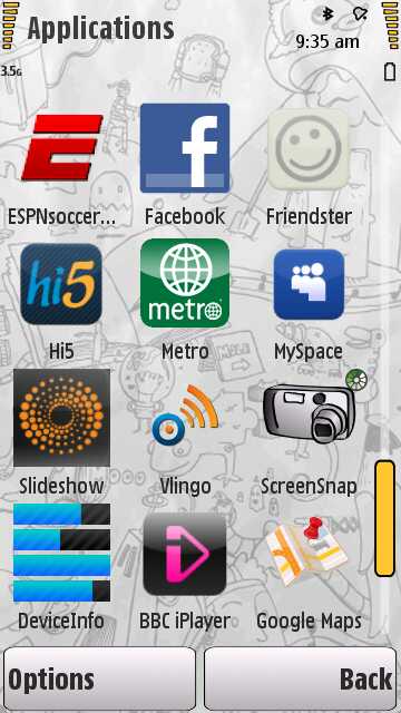
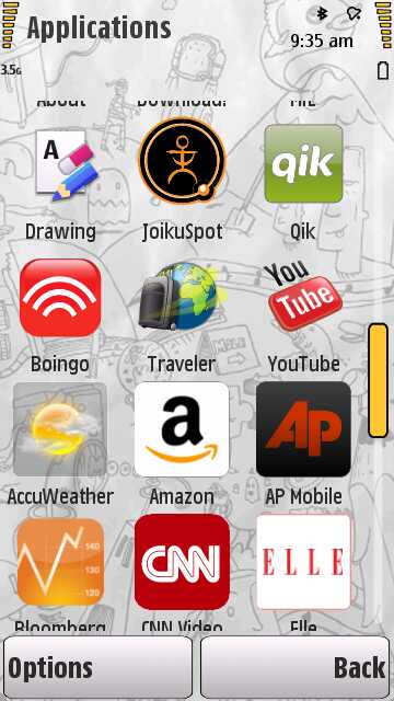
I still maintain that S60/Symbian is the most feature rich mobile platform bar none. The iPhone ecosystem may have its legions of small add-ons that you can have fun hunting in the App store, but the N97 mini (for example) comes with around 70 apps (depending on how you count) out of the box. In terms of all common functions and social networking, it's all there without having to look further. And the Ovi Store is there when you do want to spread your wings.
I'm sorry if that sounds a bit fanboy-ish to proponents of other mobile OS, but it's true. Part of the reason why a large percentage of S60 smartphone owners never install third party applications is because there's little need. Whereas with some other mobiles, even the average user quickly runs into 'how the heck do I...?' and goes looking for an add-on application or plug-in to do the job. You may recall that I did a feature, 'Three Apps on my Smartphone, and I'm still rolling along'? This rings even truer on the N97 mini, to be honest. Take the bare device, add Google Maps, a password manager and a favourite game, and you're sorted. Or at least good to go for a few weeks.
In part 3 of this dual review, I'll cover the all-important N97/N97 mini media applications and will put each device's camera to the test. I'll also deliver my overall verdict on each device. Watch this space.
Steve Litchfield, All About Symbian, 11 November 2009
Links: Nokia N97/N97 mini: part 3 - Camera, Multimedia and wrap-up
Reviewed by Steve Litchfield at