It all started with the cavemen, of course. Drawing on the walls of their caves with chalk, the first elements of language were invented. Then we had the Tower of Babylon (apocryphally) and the Romans and Greeks and, before you knew it, the world was awash with written languages, each of which does a very good job at describing just about anything you need it to describe. But there's still something appealing about a picture - "A picture speaks a thousand words" is the old adage. Which is why, when computer GUIs were created, icons started to be used to add quick recognition to common application names and functions. 20 or so years later and our smartphones are festooned with them.
Yet it's possible to get icons horribly 'wrong'.
You see, icons save time because the human brain can recognise and process the meaning of an icon faster than it can read the accompanying text label. So far, so good. But if the text label is omitted then the icons had better be damn obvious or the user is going to waste even more time trying to work out what the little picture 'means'. So, for example, we have disasters such as:
- Most desktop software packages that abandon text labels for just the bare icons - it's all very well having 'tooltips' that appear when you hover the mouse over an icon, but if you have to do it almost every time then there's a net loss of efficiency.
- The applications menu on most Sony Ericsson/UIQ phones - typically, the icons and their labels were separated, meaning that as you scan through the icons, you have to flick your eyes up continually, in order to work out which icon means what. The standard Palm/S60/iPhone/WinMob method, of keeping icons with their text description, works a hundred times better.
All of which brings me to the closing focus of this feature/rant: Custom icon sets in S60 themes.
At first sight, a dramatic new theme is a good thing, bringing freshness to what might be considered a tired old interface - hey, everything looks new again! But then the reality sinks in that because almost all the icons have been altered, often unrecognisably, you've got to revert to reading the text labels rather than working visually with the icons.
And then a week or so later, you decide to try another theme - with a completely different set of icons again! Repeat a few times and your poor befuddled brain can't recognise anything anymore and you're only really using the text labels. Making having icons at all rather pointless.
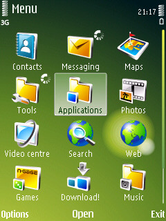
Left: A typically moody theme with custom icon set / Right: A theme with restrained tweaks on Nokia-official S60 (5th Edition) icons
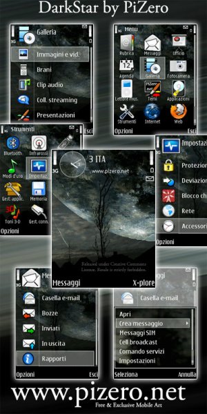
Darkstar (by the brilliant, but in this case useful-as-an-example PiZero) / Spring with Ladybug (by the equally brilliant Flahorn)
My belief is that theme designers are largely wasting their time creating radical icon sets to match their backdrops and theme elements. By all means tart up the default S60 icons a little (e.g. the 'Flahorn' ones and the 'S60 5th' ones recently), but don't take us into the 22nd Century - most of us are still grinding our way into the 21st!
NB. Nokia are as guilty as the third party theme designers. The people in the Eseries team consistently choose weird and unmemorable icons for many standard S60 applications. The very first thing I do with any Eseries phone is install a new theme with more standard icons so that I stand a fighting chance of finding my way around....
Luckily, many theme designers recognise ludditessensible people like me and include a 'Default' version of the main .SIS installation file. What this means, if you're new to themes, is that the main theme graphics are still there, but that the original S60 icons from your device will be used for the applications. This is certainly the route I go down.
Am I being unfairly harsh on custom icon sets? Am I holding back progress in graphical UI enhancements? Comments welcome!
Steve Litchfield, All About Symbian, 23 April 2009