One of the things that is constantly being touted about Symbian is the lack of a modern User Interface and how the other major platforms are smoother, more fluid, easier to use, and that is what helps make the purchasing decision. Over the last few weeks, for example, I've been looking at Android (via the ZTE Racer) and have given it a solid workout in terms of real world usage.
I want to point this out, because when people start shouting that I just need to use the UI like it was meant to be used (no matter the platform) then it would all work out perfectly. I beg to differ in the kindest possible ways. There are things I would change in all the handsets, strange decisions that make no sense (apart from possibly to evil software patent lawyers) and generally polish so they work as expected and don't leave the end-user with a "what now? Do something!!!" look on their face.
But at the basic level, each platform has a standard looking menu, a grid of icons to launch applications and shortcuts, and an area for soft-key buttons for popular functions. There is very little difference in the functionality of each device. 80% of what you know in Symbian applies to Android, a different 80% to iOS, and so on, round all the devices in your multiple pockets.
Look Through Any Window
But a UI can make a huge difference – and I want to go back to one of my pet theories that the music player in a modern piece of Consumer Electronics can summarise the whole experience. It has to cover connectivity and data transfer, it has to parse a huge amount of information that can displayed in multiple ways, it has to react to user input almost instantaneously, be portable, quick to use, and deliver on expectations.
And the navigation must not look like a collection of spreadsheets.
So for the last two weeks, I've been having a look at a UI with a difference, a UI that puts music at the forefront and appears to have rewritten the rulebook.
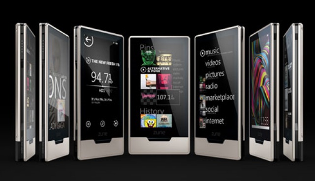
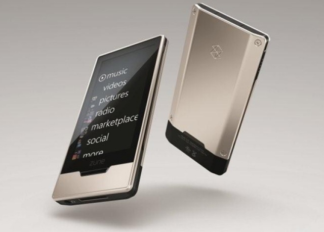
I've been using a Microsoft Zune HD.
Weapon of Choice
"Hold on a minute, this is a Symbian site, why are you about to discuss Redmond's ugly stepchild of a media player?"
Long ago, when the Zune hardware first came out, it was derided for bad style, no focus on the user experience and was pretty much perceived as a joke. That's no longer the case, and I'd say that as a media device, the Zune is one of the few pieces of tech that gets close to the dominance of the iPod Touch in this market. There's echoes of what Symbian is going through in terms of media perception, and this is an ongoing example of one way something can be turned around – you just keep doing the best you can, promoting it and listening to users and commentators.
There is also an interesting mix of focus and over-arching vision. The Zune HD may have Wifi, and the ability to connect to an online app store to download a very small catalogue of additional games and applications, and there might be a barely competent web browser in the package, but it's clearly designed to be a media player first and foremost. It's taken one function, and it does it incredibly well.
So where does the vision thing pop in? It's called Metro, and is the common UI language of the latest Microsoft products. When you look at the Zune HD alongside the upcoming Windows Phone 7 devices, you'll see a strong similarity in how the UI works – but you'll also see concessions and changes because the environment of a smartphone is not just about being a music player. But when you have such a “language” documented and strictly used, that's when the oft mentioned fluidity and ease of use across areas becomes automatic for users.
And finally there's the joy of using the UI itself. If you've ever watched the Japanese Manga series and seen computer interfaces with words flying all over the screen, random graphics and images bouncing around and lots of slides, taps and holds from the user and wondered if it would ever work in real life, let me introduce you to the Zune interface.
I would have loved to talk about the Zune Pass, where for $15 a month you get access to the entire Zune HD online music store catalogue and can download as much as you like to your PC and Zune – and every month you can also download 10 DRM free MP3 tracks for your collection. Unfortunately this music store model, which is the closest I've seen to Ovi Music, has the same problem as Ovi Music - it's DRM-heavy. In this case, region locked, to the US market. Yes there are hoops I could jump through to experience it, but just as Nokia have to deal with the music industry, so do Microsoft.
But the connected experience of the Zune HD anywhere in the world makes consuming your music and exploring it a joy. Jumping between albums and tracks to find out more from a band is just a matter of touching that element on the screen – and if the Zune HD and the Zune Store know more about an artist, you'll find pictures, biographic details and a full discography (including tracks you can't download, a nice touch to still list them) and a photo gallery of the performers to look through.
Move between tracks? Just slide the artwork to one side with a flick of the finger. Perhaps the only strange choice is the complete lack of volume or playback buttons – you get a power button, a home key and a “media” key, which then brings up all your play/pause, forward, rewind and volume controls. Yes it keeps a clean line to the device, but I think I'd want some hard volume keys on the outside at a minimum.
Every track has a little plus symbol as well, tap this to start building a “now playing” playlist, which can then be saved for later use or just wiped to create another temporary track. It's fast, smooth and this is one of the easiest mobile devices to build up transient playlists, such as lining up four tracks while doing the dishes. This playlist creating is far ahead of anything on iOS, Android or Symbian.
And then there are the extra exploration features, which not only list all the content from a performer on your Zune HD, but also have cached results for everything available for download from the Zune Marketplace music store, as well as related artists you can explore, and it's not limited to what's in your catalogue. Remember that unlimited music pass? This is where it's supremely useful and is light years ahead of the Comes with Music (Ovi Music Unlimited) offering in terms of discovery. Even without it, you still have thirty second samples to get the flavour of new names and old favourites.
That's the rub – through the interface on the Zune, you are encouraged to play around and explore the music you have, and to find more artists. It's not just a media player, it's a media discovery machine... as long as you have Wi-fi connectivity - there's no 3G option, that'll have to wait for Windows Phone 7, which I suspect won't be that different from the Zune HD's interface.
Let's have a closer look at the Zune in action, in the video embedde below. Apologies in advance for the focussing problem - Steve's promised to give me lessons on "Depth of field" for next time!
You Can't Always Get What You Want
So then, what lessons can the Symbian Foundation and their partners take from the Zune experience? First up, I hope they have had their hands on this device, because there are a bucket of UI design lessons in here to be learnt simply by stepping away from the normal presentation but still sticking to some of the expected rules. If you need some bullet points, here there are.
- When designing a UI, don't be afraid to be radical and start afresh. It's acknowledged that Symbian^3 will have a lot of the paradigms from Symbian^1 but will be tightened up in implementation. That's good, but you can break away from this and not lose the users.
- Any UI needs to be consistent and administered with a whip hand to keep everything in line. One of the big questions I have on Windows Phone 7 is how well the Metro UI rules will be enforced in the applications. Media playback is one thing, but the ballooning needs of applications for a full mobile platform is something altogether harder. But if the basic design is correct, it will carry through. The same is true for any platform.
- Those first impressions count, especially in regards the responsiveness of a UI. This is just as important as the eye candy. I remember my first experiences with the Nokia X6 around a year ago and the lethargic music player. The X6 was thrown back into my rucksack for the rest of the journey and if it had been shop bought (and not a long term review unit for All About Symbian) would have been sent home in disgrace. Yes, the X6 improved (it's now my Weapon of Choice for day to day use) but it essentially failed the out of the box experience and that should have been picked up before it hit retail.
The Final Countdown
Even with the acknowledged modifier of “oooh this is new and shiny”, if I had to make the choice for a device to be my music player on my travels, I would be putting the Zune HD at the top of the pile. I do have some reservations about the device (for example, it does mean moving back to a two-box solution, I'd still need to carry a smartphone to actually do anything; and it does mean carrying another cable with me to charge it, there's no standardised mini or microUSB port on the Zune HD), but in terms of a large touch screen interface to handle media, it's top of the class.
Now let's see what the competition can do to try and beat it.
-- Ewan Spence, Sept 2010.
And thanks to Zune Things (www.zunethings.co.uk) for the supply of the Zune HD 32GB used in this feature.