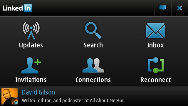
And then it hit me. The icon layout and initial screens are exactly the same as I remember from the Psion Series 3 applications
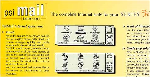 Apologies for the digital archaeology, but spot a familiar layout?
Yes, in 15 years of portable computing advances, we're still left with six icons and a few soft-keys being the best way to navigate a mobile application. While pixel density might have increased, the physical screen sizes are similar. Touch screens have been added and colour has been splashed around. Processors have got faster... yet we still have the paradigm of a grid of icons for our main features, with some menu buttons to hang everything else off.
In fact, the grid of icons UI is everywhere. The application launcher screen of Symbian^3 packs in a few more icons, but is essentially the same style - a style that's been present in the various Symbian UI's going right back to before it was called Symbian. You'll see a similar idea throughout the mobile market, both on iOS and Android, as well as Blackberry and Web OS - all of which can follow the lineage of the icon/title back to early devices such as the Apple Newton and the Pilot1000.
Of course the mobile device is not the beginning of this trend - look at the desktops of the early 80's home computers once they went wysiwyg ("what you see is what you get"). It's a grid of icons, with the name underneath each, and a bundle of menus under some icons. It's pervasive, and has been one of the key ways we've interacted with our computers for decades. Can I see it changing in the near future?
To be honest, probably not.
There have been tweaks to the basic idea, the two most noticeable being the ability to have "favourite" apps in a quick launching bar or on a second "home" screen, while the addition of the 'widget' means that the icon area and title can be used to convey changing information. The much vaunted live tiles in Windows Phone? They're just big icons that can change a lot, hammering these renamed widgets into a very strict grid system.
But it's still your icons, in a grid, with information. The only tweak we've seen in the last few years is that the text handle, commonly outside the icon, is now encroaching into a slightly bigger icon, but fundamentally I don't think that the way we access applications on our small screened devices has changed over the years. While everything else has taken huge leaps, the broad stroke of the interface is still as it was ten, fifteen, even twenty years ago.
In that period there have been a number of advances in how we interact with our portable devices, many of which have promised revolutionary ways to navigate our phone. Voice control is still one that is wanted by many, and if you can pull off a passable American accent, Google Voice shows promise. Voice dialling has been a feature for many years now, where you train your phone to recognise a voice pattern for a name. Right now, would you trust a phone who's primary interface was your voice? I don't think I would.
Gesture control is another sexy area that some think will revolutionise the UI, and while it has potential for some secondary functions (pinch to zoom being one of the more obvious ones), I've yet to be convinced that a gesture launcher would have the mainstream appeal that is needed at the top level of a smartphone operating system.
All these new bells and whistles are just that, bells and whistles. For all the new inventions, none of them have caught the imagination of developers to become a "must have" part of the UI that handles what is, arguably, the focus of smartphones over the next few years - as application-based devices.
Neither do I think that we're going to see anything new in the near future make it to the launchers. What we have now is going to be how the smartphone is operated for many years to come. Is that a shame? Perhaps, but it is a commercial reality. If you could hand a modern smartphone back to the early PDA users in 1990, they'd be at home and know what to do with it. The same would be true if we got a hold of a 2130 lineage "super-dooper-phone."
Books will have pages to turn, three minutes will still be the best length for a pop song, and we'll continue to use a grid layout of pictures to launch our applications.
-- Ewan Spence, June 2011.