Review: Nokia N85 review - pt 2 - The User Interface
In this, the second part of our look at the Nokia N85, I want to carry on from part one's look at the hardware and styling of the device. Running S60 3rd Edition Feature Pack 2, the N85 sees tweaks to the interface and some of the built in applications to help the user experience. How successful have Nokia been?
Nokia have previously made huge noises about the 'personalisation' of devices, which is understandable as your smartphone is one of the few devices that you are guaranteed to be always carrying with you. Nokia have stressed that many times, and the theme support in Feature Pack 2 is impressive. As well as allowing you to use pre-existing themes (much like Steve in his review of the Samsung 7110, it took me about 30 seconds to decide to install the Sunrise theme), you've got a lot of options to tweak the visual options around the device, so you can build up a theme yourself, or personalise one you have already installed.


Getting online: N95 (l) and N85 (r)
One option that isn't as flexible as I hoped was the size of the text in the real world. The settings tab has options for 'large, medium and small' font sizes, but this isn't granular enough for my liking. The N85 has a 2.6 inch sized screen, which is smaller than the N95 8GB I am used to - that has a 2.8 inch screen. Even though they have the same pixel resolution (240x320), the Finnish designers have placed less information on the screen of the N85 compared to the N95. In one respect this is good design, because the perception is that this smaller screen isn't full of very small, pokey icons and text.
But it seems to be against the ethos of the personalisation that Nokia push with theme support across their literature. They've gone part of the way there with the font size option; there's no reason they shouldn't make the final step and allow the user to select just how much information they will allow on the screen.

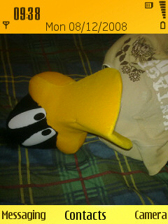
Choosing standby screen (l), horizontal icon bar (c), Basic with a picture of a cuddly Daffy Duck (r)
It's most noticeable on the standby screen - note your icons have been reduced from 7 icons on the N95 8GB to 6 icons, and the font size will reduce the number of lines that active stand-by applications can use. My personal preference is to always have as much as possible on the screen, because information to me is more important than style. The N85 turns on the style tap just a little bit too much for my liking.
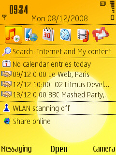
What is new on the standby screen is that you can theme this, with three different looks. The horizontal icon bar is the familiar look from the active standby screen we have seen on other devices, while the Basic view is the same as turning off the active standby on previous devices - but very nice if you have a desktop picture you want to show off. The new addition is the vertical icon bar theme.


This is faintly reminiscent of the Orange Home Screen that the UK provider has bolted on to previous S60 smartphones. The cursor will move up and down the icon strip, and hitting 'right' will open up a more detailed box. Select the shortcuts icon and your previous shortcuts that you set up (that sit across the screen in the horizontal bar) are now listed for you, Calendar provides your upcoming appointments, and so on.
While I'm going to stick to the horizontal bar (more info, less clicks, you know my drill now), the vertical icon bar is going to be very popular. It allows you to show off your desktop with nothing getting in the way, it's nicely organised, and your information is easy to get to. As long as I can always switch back to my preference, Nokia can keep up this sort of cool innovation as much as they like.
S60 has always been a 'busy' operating system, with lots of items and options on display, and with a number of functions that were never really documented or available to the casual user. One of those was the basic task manager, that listed all the open applications and allowed you to close them or jump to them. This is still here, but now runs horizontally along the bottom of the screen, although the text caption naming the application has been removed, so I hope you know your icons - as before, the close function is not visible, but tapping the 'C' key brings up a confirmation dialog.


It's also unlikely that anyone is going to miss out that this task switcher for open applications is part of S60, because it is at the top of every single menu no matter what application you are in! From being an undocumented fuction, to screaming its presence at every opportunity; that's a little bit of overkill from Nokia. Thankfully the cursor's default position in the menu bar has moved down and now starts on the second option in each menu (i.e. what used to be the first choice), but in a screen that is already 'optmised' the addition of a new line to every menu pane does not seem a sensible use of screen real estate.
What is interesting is the addition of another soft-key option on many screens. It's subtle enough that it took me a while to notice that the function of the 'select' button in the cursor arrangement was labelled in the centre of the screen. A nice addition and gives more guidance to new users of FP2 devices.
The fact that this is very similar to how Nokia's proprietary S40 design works is probably not an accident. We've already seen Nokia's plans for Ovi involve all their handsets, not just the Symbian-based S60 devices, so this should make the porting and design of applications consistent over the whole range of Nokia phones, not just their smart ones.
The Multimedia menu is also present, and as the services that Nokia provide on the phone have grown and matured, so has the use of this menu. Accessed by the silver key on the right hand side of the face panel (which is thankfully smaller and less easy to hit by accident than on previous Nseries devices), you have access to seven major areas that you'll be using the N85 for, namely the Internet (specifically your web browser), your list of favourite contacts, your music, your photos, all your video on the device, the Maps service, and N-Gage Games.


In essence, the multimedia menu acts as an app launcher, but when launching each application you can launch it with a specific command - i.e. rather than the web browser, you can launch the web browser with a specific URL. Much like the vertical stand-by screen, you'll be choosing an area (e.g. Maps), then choosing a function (show me my places) and you'll then be taken to the application.
It does add in keypresses to the process, but with the complexity on a smartphone nowadays this new hierarchal approach may be what is needed to help users get around all the power of the N85 - because there is a lot to do, even before you add in third party applications. The changes to S60 in Feature Pack 2 have certainly made it easier to find Nokia's flagship applications, but perhaps to the detriment of any third party applications that are installed, although if you do go down this route there must be an expectation that you're happy to fiddle and play around with your phone to a certain extent.
Some other notable tweaks by Nokia include the Application Update icon - again geared towards the Nokia applications and plug-ins, this will run over your system and let you know what requires updating. After upgrading to the latest firmware last week, all the updater reported was a new plugin for the Messaging client to provide Mail for MS Exchange support. It's a nice touch, and something that reminds me of the software package managers that comes in the Ubuntu version of Linux. The only difference there is that Ubuntu can update any application installed through the package system on the device, whereas Nokia's App Update only handles Nokia applications. I'm hoping that this will also be available to developers as soon as possible, because it removes a lot of hassle involved when you have extra applications installed on your phone.


The Application Manager has had a little bit of a spruce up as well, with the addition of a top level menu offering three choices - Download Applications (which takes you to a URL in Web rather than the built-in Download application), Installation files (which shows previously downloaded SIS files that you can install onto your smartphone), and Installed Apps (which takes you to the traditional 'here's everything on your phone' view). Again, it's a small UI touch designed to help those new to S60, rather than the old hands who would be happy with a command line.
The N85 also has the distinction of being one of the first Nseries devices to ship with the N-Gage client pre-installed, as opposed to a shortcut icon or demo application. This should help drive a lot more first time users to the N-Gage, and the addition of a free N-Gage activation code in the box (at least in my marketing package) will be welcomed by many.
S60 is still a complicated beast, with many applications and a lot of features. Stop and think for a moment how you would make sure these are all accessible with only a few button presses; and you're not allowed arcanekey combinations that need to be committed to memory. Nokia have used some 68 icons and folders on the regular S60 application screens, so the shortcuts and tweaks to the standby screen, alongside the multimedia key, provide much needed simpler routes for both new and experienced users to move around and control the N85.
A lot of people will label this as being a clunky UI. If you are going to provide a huge amount of value added services via software, they need to be accessible, and I think what S60 has here is a good balance of flexibility, ease of use, and power. And that's a hard mix to get right.
The N85 sits in a space where power users may well be tempted to move 'down' to it (although in all honesty it's more a sideways move from the N95 8GB) while many S40 and feature phone users are going to look for something with power and features and conclude the N85 is best placed. Mix those user skill levels and the UI challenge is a tough one.
But the N85 answers that question well. There will still be stumbling blocks for new users (there always are) but everything appears well laid out, easy to reach, and has been thought about from a non-technical perspective.
-- Ewan Spence, Dec 2008
In the next part of this review, I'll be looking, and listening, to the media options on the N85, from the camera and video, to the music player, podcast catcher and online video options available.
Bonus link: Rafe's original hands-on first impressions of the Nokia N85
Reviewed by Ewan Spence at