Review: Living with Symbian^3, Part One
Score:
70%
Rafe and Steve have already written extensively about Symbian^3 in their N8 reviews (e.g. three recent parts here, here, and here). Since then, I've had a month long trial with the Nokia C7 in which I've used it as my primary phone. While Rafe will be continuing our full, long term hardware review of the C7, I am taking the opportunity to give my impressions of using Symbian^3. Everything has its pros and cons, and Symbian^3 is no different. Here I present my own in-depth take on the best, and worst, of Symbian^3.
Version Reviewed: 12.003
It's fair to say that Symbian^3 doesn't look any different to the likes of the N97 and C6-00, at least in static screen shots. For better or for worse, this is because the user interface (UI) was never intended to be updated in Symbian^3. This was a deliberate move by Nokia, in Marko Ahtisaari's words, "there is a lot of muscle memory out there". That's not to say there aren't any user interface changes with Symbian^3. The most notable change is two extra home screens ...
Multiple Home Screens
Each home screen is accessible by touching the centre-bottom (on the C7) button (which also indicates the home screen you're currently viewing), or by swiping left to right. Straight away, a feature I like here, is that the screens wrap around, rather than stopping at either end. This works perfectly with three home screens because it means every home screen is only one swipe away. As recently discussed here at All About Symbian, there is a case to be made for not using multiple home screens. Therefore it's good that Symbian^3 has the option of enabling or disabling each home screen.
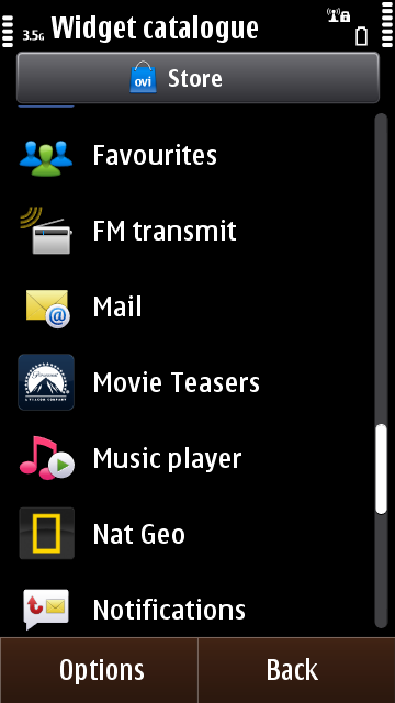
That's all well and good, but what can we put on the home screens? Unfortunately, there is little new compared to the home screen widgets available to the N97, N97 mini and C6-00. There is a limited set of icons that relate to the phone functions. Other widgets come from bundled news applications, and more widgets can be generated from the subscribed RSS feeds subscribed in Web.
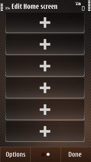
Symbian^3 home screens - A sample of available widgets and a blank canvas.
A minor note is that Symbian^3's contacts widget is a carousel of favourite contacts, rather than blocks of four entries, as with the application shortcuts. This is a completely different list to the "favourites" list found in the Contacts application. This means the user is limited to having only one scrolling row of contacts on the home screen. This is unfortunate for anyone hoping to dedicate a whole screen to friends and family, which is something that would have promoted emotional engagement with the phone.
Symbian's six slot approach is highly granular in comparison to Android's home screens. While power users may find it limiting, consider that Symbian will be marketed to users upgrading from feature phones. Therefore, this restricted approach means there is less of a barrier to configuring one's home screen(s). Having said that, I think Nokia have missed a trick by not implementing widgets which can occupy multiple slots. For instance, a multi-slot Calendar or RSS widget could impart much more valuable information to the user. Furthermore, a photo frame widget would lend another degree of emotional engagement.
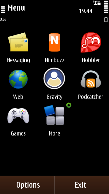
On a final note about home screens, Symbian's big advantage over Android is that its app-grid is infinitely organisable (via folders), thus making home screen shortcuts almost redundant. This is in contrast to the app-grid found in Android, which is a great waste and cries out at the user to add application shortcuts to its home screen, making DIY app-grids. Mind you, Android makes it simpler to add application shortcuts to the home screen.
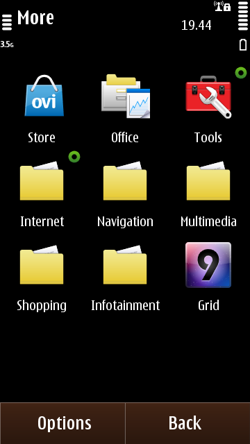
David's application grid - An example of how far you can reorganise the Symbian application grid
Behind the home screens
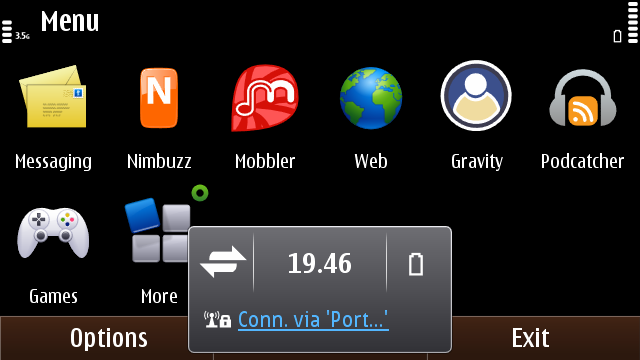
The design of Symbian^3 demonstrates only an incremental change from S60 5th Edition. Wherever possible, the old touch UI has been streamlined and function buttons have been absorbed into long-press context menus. In places, this has led the familiar right-hand column of buttons to be done away with. The Options and Back/Exit buttons now remain at the bottom of the screen in both landscape and portrait. In landscape, they are now joined by a clock widget. This widget also allows the user to access any unread messages, and access connectivity menus (Bluetooth and Networking). The connectivity menu was previously an Easter egg of S60 5th Edition found by tapping just to the left of the battery meter (which still works in Symbian^3's portrait mode).
The Symbian application grid in landscape, showing the connectivity menu.
Something that has been completely revamped in Symbian^3 is the task switcher. This is a seemingly trivial aspect, but I think it's one of the best new features in Symbian^3. The new task switcher now provides snapshots of the running applications, giving the user faster recognition of what's running. A long-press on one of these thumbnails now gives a context menu allowing the user to close that specific application or to close everything at once. The latter might sound trivial, but it's one of the many touches of polish in Symbian^3 that make so much sense.
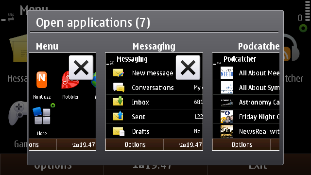
The new task switcher in Symbian^3.
This aspect of closing applications manually is a big talking point amongst geeks and enthusiasts. Personally, I prefer the definite knowledge of what my phone is and is not running. The need to close applications is often seen by non-Symbian users as an indication of older Nokia phones being shipped with insufficient RAM. This isn't the case here though. Having used Android for quite a while now, I still find its Recent Applications switcher to be mentally uncomfortable. I understand that Android manages applications automatically, and that for applications that don't require a persistent state (e.g. simple apps like Contacts or Calculator), it is fine to let them drift away into the background and let the OS kill them as necessary. However with more complicated applications, I'm never quite sure whether I'm going to find an application how I left it, or whether it will have been shut down. This situation is a lot clearer on Symbian^3, especially with a small degree of user supervision.
In the next part of my Symbian^3 review, I'll look at the built-in applications.
David Gilson for All About Symbian, 7th January 2010.
Reviewed by David Gilson at