Review: Nokia N8: part 5 - Real world, Performance, Application set, Homescreens
In part 5 of our Nokia N8 review, I look at the device's speed, responding to criticism of the speed of some common operations, at the N8's application set, at Symbian^3 additions such as the contact quick dialler and extended homescreen, at User Interface quirks that remain, and at general compatibility. See also part 1 (hardware), part 2 (camera), part 3 (multimedia and games) and part 4 (email, web, connectivity) of our definitive N8 review, plus my head to head comparison with an Android camera-centric flagship.

So far then, we've established the N8 as having a superlative camera, great hardware and build quality, good multimedia handling and gaming and 'good enough' email and web applications. The theme through all of these review parts is generally very positive, though we've pulled no punches at pointing out some of the negatives and any relevant caveats.
The same feeling is going to run through this review part, in which I wanted to look at the N8 from the point of view of day to day use and round up some of the application and interface features which haven't been mentioned in depth so far. Whereas with many other Nokia smartphones of the last couple of years it had been a case of piling up pros and cons more or less equally for each, with the N8 there's a definite bias towards a smartphone that it's hard for someone with even a passing acquaintance with the Symbian OS to dislike.
Performance issues?
Which is not to say that someone coming from the iPhone or Android smartphone worlds won't have a darned good go (at disliking it). As an example of this, and as a launching point for some of my own opinions and rebuttals, here's a typical blogger 'comparison', from Edward Umana (in the USA) - clearly something of an Android fan but also passingly acquainted with Symbian - who makes the following points:
"Very large web pages cause Web to struggle". The example shown is Engadget.com, whose desktop-designed site currently runs to just over 2.2MB of code, javascript, images and other objects. In one sense, there's no defense here - with the N8's RAM and processor, it should be able to download and decode this large a page, with all content and still stay responsive. It's clear that a totally re-written 2010 Symbian web browser with, in particular, a faster javascript engine can't come soon enough (Opera Mobile is here now and Nokia's new browser is a month or two away).
On the other hand, the Engadget page is a particularly complex entity - it's telling that tapping on 'Stop' halfway through the loading of engadget.com (to terminate the interpreting of much of the Javascript and the loading of any extraneous objects) results in a page that's very responsive and that it's clearly this last content that's causing the problem. I tried the desktop versions of Mobile Burn and Gdgt, both equally 'heavy' pages and, after letting the page load completely, had little problem scrolling around and zooming.
A core issue isn't actually that some pages don't appear to load fully or freeze - it's that Web's performance while loading isn't well optimised. On the iPhone and Android browsers (all based on versions of the core Webkit engine), it's possible to scroll around even before all the images and animations have fully loaded - from the user's point of view this is a natural thing to want to do (though as a programmer I'm thinking "No, let the page load before trying to confuse the application!") Hopefully the new version of Web will be much better at this sort of 'parallel' activity.
In the real world, of course, loading desktop class, Javascript-heavy sites from the gadget world is arguably extreme behaviour. In most cases, normal people will type in a site URL and be directed to the appropriate 'mobile'-optimised site (bbc.co.uk is a good example of this). Unsurprisingly, such sites work beautifully on the N8 - though it's not always appreciated that a number of mobile sites don't work well on the iPhone, for example (the sparse layout confuses Safari's algorithms). With the 16:9 portrait screen and an emphasis on one-handed use, it's fair to say that many N8 owners are unlikely to either want to browse full-on desktop web sites or have problems viewing the content they're after.
So I'm not giving Web a free pass here - but it'll do for 99% of owners until its replacement becomes available in an over-the-air update later in 2010, a month or two from now.
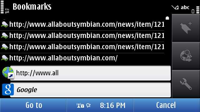
"Autocompleting web addresses isn't obvious" (because of the dichotomy between the URL bar itself and the Symbian text entry screen). In other words, you can start typing "all" on an Android phone and the browser's auto-complete will show you matches from your history because the keyboard itself is overlaid on the main browser screen. With touch entry on Symbian OS, both T9 and QWERTY virtual keyboards are brought up full-screen, giving maximum area for clear entry but at the expense of being able to see the page the keyboard was 'called' from. In fact, you can type "all" and then tap on the green 'tick' and you'll see the auto-complete proferring suggestions, in just the same way as Android or desktop browsers - but because the user is typically focussed on the raw text entry, they may not know about exiting this screen and seeing what Web has to suggest.
I doubt this text entry method, much maligned in some N8 reviews, is going to change overnight. Personally, I don't think it's a huge issue and find the iPhone/Android/Windows Mobile technique, wherein you see a bit of the underlying page and have to scroll around like mad to try and see the right dialog line, potentially more confusing. But this is obviously a personal preference.
As an aside, the blogger refers to the portrait T9 keypad as 'annoying'. This is understandable from the point of view of someone young, brought up on a diet of iPhone etc, but readers here will appreciate that in portrait mode a standard phone-like keypad is going to be both quick and familiar to the vast majority of the phone-buying public.
"Mail is slow and poorly laid out". As someone who's been something of a critic of Nokia Messaging since day one, I'm only slowly coming round to relying on it day to day. For Gmail, it's certainly a lot slower and less functional that the Android dedicated Gmail client, but it's fairly obvious that this is something of a special case, seeing as Google make both Android and Gmail - set the iPhone's Mail client or the generic Android email application to work on another mail system and performance is similar to Mail on the N8, which does at least, through both its Nokia Messaging back-end and through its 'generic' IMAP functionality, boast pretty wide compatibility.
It's true that Mail can be a little slow, especially if set to only grab 'headers' rather than full emails - meaning that when you tap on an email you've got to wait a few seconds while the body of each message is retrieved. But, once you've got it set up as you like it, it's as usable as any other generic mobile OS email application.
I'll take slight issue with it being poorly laid out too. Edward first of all shows that Mail on the N8 only shows five emails per screen, compared to the eight on the Samsung's display. Quite apart from the fact that the latter has a 4" screen, compared to the N8's 3.5", many people (including me) would rather have a larger, clearer font. In this particular case, the Galaxy S's OLED screen really burns through its battery by sticking to the white Android background and spindly black fonts. The next allegation is that HTML ('rich text') emails are displayed as-is, with the Web engine defaulting to a rather small font unless a particular overriding assignment is found within the user's email. After years of people moaning that email on Symbian meant only seeing plain text, I'm finding it a little ironic that we're now seeing people moan again now that HTML email is supported. The underlying fault is that the default font used in Web is just a size or two too small - though hopefully this is something that's trivial to change by Nokia's programmers.
"Some widgets and applications still bring up a 'Connect?' dialog". It's true they do. In general, though, this will be (downloaded or bundled, depending on market) third party applications that were originally compiled for Symbian^1, i.e. S60 5th Edition. The core, built-in, N8 applications just go online silently. It's fair to say that as third party apps and widgets get updated, these extra dialogs should go away completely.
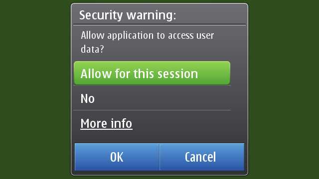
It's also worth noting that the original intention of all the 'Connect?' dialogs - to avoid bill shock from mobile data use - is now a thing of the past, thankfully. On the one hand because of the ubiquity of flat rate, or at least much cheaper, data. And on the other because these days you can go into 'Connectivity>Settings' and simply set data to 'WLAN only', i.e. you can turn cellular data on and off with a simple software toggle, iOS-style.
"The fonts used in Nokia Social are way too small". Completely agree - and this is another symptom of the poor default font choice in Web. I'm guessing that whoever signed off on the design for the Social widgets (currently just Twitter and Facebook) was, like me in my walkthrough, looking at the screens in an emulator on a nice large desktop monitor. On the 3.5" screen off the Nokia N8, the main display fonts are just ridiculously tiny and this issue should have been picked up by the programmers testing the phone in real life.
"Because applications are buried in sub-folders, it takes too many taps to get to them". This is easy to refute, of course - the whole point of putting little-used utilities and apps in sub-folders is so that you don't have to scroll through their icons trying to get to something you use a whole lot more. And most reviewers completely miss the fact that Symbian^3, like S60 before it, is completely customisable in this regard and you can 'Organise' your app icons however you want. Most S60 owners have ended up with a particular order and hierarchy that's personal to them and spend five minutes with a new device, shuffling icons around to suit.
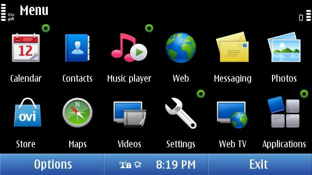
More or less the default icon and folder order on the N8 - my first step would be to create a Games folder and shuffle the media apps around, but everyone's different!
(My thanks to Edward for putting forward his video observations and (hopefully) not minding me replying with some vigour.)
___________
I've now been using the Nokia N8 as my main device for two and a half weeks, day in and day out, and I've only had two performance concerns:
- As mentioned above, the Webkit browser engine is a limitation, speed-wise. This is used in email display, Nokia Social, the Ovi Store client, various Webruntime widgets and the main browser. OK, so that's quite a lot of uses, and quite a few opportunities for slowdowns. It would have been better for half these uses to be catered for with native applications, to be honest (as we've said before). The new browser later this year will hopefully also get used by these other modules, bringing greater speed to all.
- Although Symbian is, as usual, fully multitasking, this doesn't mean that things don't need to be fine tuned under the surface. When playing games (where smooth frame rate is essential), I've seen significant slowdown when an email sync is taking place in the background. I'd expect a computer with the N8's specifications to be able to handle doing two things at the same time, especially as email retrieval could be set at quite a low priority in terms of processor resources. Again - hopefully - this will be fixed in an optimised version of Mail in an upcoming firmware.
Neither of these concerns are complete showstoppers, but they should both be high on Nokia's to-do list to look at. Elsewhere, as mentioned in previous review parts, native and third party applications run quickly, Ovi Maps runs very efficiently, games are smooth, video playback works well - even large music libraries don't seem to phase the N8.
The N8's application set
The number of apps and applets shipped with S60 had been growing for years, from the days of the 7650 up to the N95 and N96, over 50 in many cases. S60's multi-foldered main menu did a good enough job of organising this mass of apps, but it was still a common complaint of many people that some key utilities were buried two levels deep and hard to find.
With the switch to S60 5th Edition and now its new incarnation in Symbian^3, Nokia has made an effort to bundle some of the extra utility functions into the larger main apps - so RealPlayer, Profiles, Themes, App Mgr, About, Speech, Bluetooth, WLan wizard, USB, Settings wizard, Device manager, Phone switch, Sync, Landmarks, Licences and Connection manager have all been subsumed in some way into Settings. This helped quite a bit, but we are still looking at around thirty built-in apps.
It's with this in mind that I look at the application set in the first launch firmware for the N8 and get tempted to wonder if some of the apps that are missing were omitted in a continuing cull - or whether they simply weren't working well enough yet on Symbian^3. Probably a mix of the two.
- Internet radio, an Nseries staple, is apparently imminent and will re-appear in the Ovi Store.
- Nokia Podcasting's code is more of an issue and we suspect licensing problems are afoot - the latest build of Symbian Podcatcher isn't quite up to the same standard, but does largely fill the gap.
- Share online is apparently dead in the water, being based in older code, though as already mentioned, the free Pixelpipe Send and Share in the Ovi Store does a better job for more people to an incredibly wide range of online services.
- Converter (for units) is simply missing, which is a little strange, since its code talks to no other apps or services and this would have been trivial in put in and test.
- Location/GPS Data is also missing, which was a shame. Although I never used its position reporting function, it was a handy way to peek at the different signal strengths being received from the various GPS satellites.
- Home media, the interface for UPnP (part of DLNA) is missing in action because the technology is also not in the initial firmware. This will very likely reappear in a firmware update soon.
Quite aside from the omissions mentioned, there have been some new additions to the Symbian application set: Web TV, Photo editor and Video editor (all mentioned at length in part 3 of our review) and Social networking (covered in part 4).
Of note in the standard application set for S60/Symbian are a few items we haven't covered so far:
- Quickoffice - this is the very latest (v6.2) version of the full Office editing application but supplied with only 'Viewing' functionality enabled, which is fair enough. If an N8 user needs to actually edit Word, Excel and Powerpoint files then the full editing version can be bought and unlocked over the air.
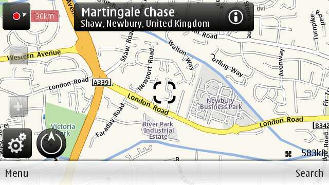
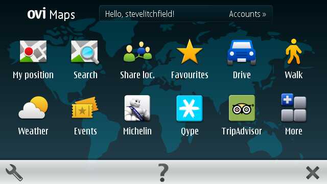
- Ovi Maps - this is the latest stable release, v3.4, and includes the revamped homescreen with extra location-specific services. Version 3.6, with multi-touch support, is in beta and should be made available through Sw update on the N8 and other Symbian^3 smartphones imminently.
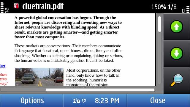
- Adobe Reader seems to be the latest v2.5 release for S60 5th Edition from the Quickoffice folks and the instance on our review device shows no sign of being a trial version. It opens most PDF files competently and has very flexible zoom options but is never fast and could do with a serious Symbian^3 recompile, incorporating multi-touch.
- Dictionary - both English on its own and with downloadable language pairs, this works (and extends, via the additional languages on the web) very well indeed, as a basic dictionary app that's always to hand.
Using the N8 after a couple of years with the 5800, N97 and even Samsung i8910 HD, there's a feeling of some things being done much better but other things having got left behind. Despite the N8's seeming delay from announcement to availability, the last few months have obviously been somewhat frantic amongst the N8 team's programmers and some applications got bumped simply because there wasn't time to get them adapted and approved.
Before passing absolute judgement on the N8's intended application set, we therefore need to hold fast and wait until the promised PR 2.0 firmware update in the next couple of months - just as we did in term of delivering a verdict with the N97. The difference between the two devices, and the reason we're able to publish these N8 review parts so quickly, is that the latter has such great hardware resources that there's no danger of the OS falling over for lack of anything.
Homescreen goodness
The story so far: since 2002, Series 60 phones have had a 'standby screen', at first just showing time, date, network and an image, but information was gradually added through 2005/2006/2007, so that everything from application shortcuts to email summary to missed calls to upcoming Calendar appointments could be included in this 'at a glance' view. And, on the whole we were - and are - happy.
With the move to larger-screened (touch) devices, starting with the 5800, this standby screen system seemed to be rather wasteful of screen real estate - with 360 by 640 pixels to fill, why not put more graphical information in place? And with the rise and rise of flat rate (or cheap) cellular data, why not put in content that is truly 'live', such as social network updates, news headlines and weather?
Why not indeed, and the N97 'widgetised homescreen' was implemented, with up to six slots for shortcuts or widgets of the user's choice. Around the same time, Android smartphones were just starting to appear with a more flexible, multi-homescreen approach to widgets and the natural evolution of the N97 homescreen was to both put in more 'swipeable' screens and also make available a wider range of widgets. This couldn't be done within the hardware constraints of Nokia's S60 5th Edition phones, since the homescreen widgets are relatively heavy on RAM - indeed a common tip of mine for N97 owners struggling with always-closing apps was to remove the two default active widgets from the homescreen, instantly releasing another 10MB or so to the OS. The N8, C7 and following devices all have plenty of RAM and this restriction is limited.
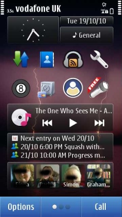
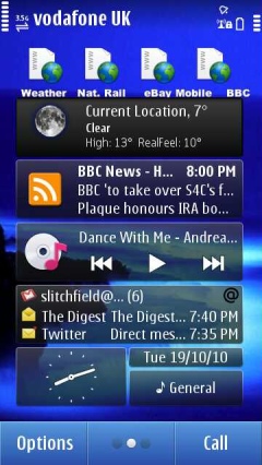
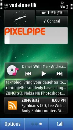
Which is where we come to the Symbian^3 homescreen - three separate N97-like panes of active (Internet-connected) and passive (local functionality only) widgets: 18 potential slots for the user to fill and generally make their own. As an example of how a typical N8 user might lay out their homescreen(s), here's what I've done with mine so far. And be gentle with me, it's a customisation in progress - I'm fiddling each day! I've scaled each screen down a little so that I can display all three side by side:
How you divide up your homescreens will be a personal thing, of course, but I opted for:
- a main 'local' homescreen - for information and functions on the phone itself. Shown here are Calendar, Music, app shortcuts and favourite contacts - these scroll left and right, i.e. it's a carousel.
- an 'online' homescreen - bringing in emails, weather, news and feeds from the wider world.
- a 'social and sharing' homescreen - with widgets for Gravity and Pixelpipe Quickpost.
Of particular note is that you can duplicate a widget across multiple homescreens - so for example, you could have time and date, plus Music player control on all three homescreens. You can also have a different backdrop for each homescreen, which helps give character and is another visual clue for which one you're 'on'.
In use, the system works quite well, though as usual with Symbian there's a little set up time needed to get things working just the way you want. For example, RSS/web feed widgets default to updating every four hours, but this is unlikely to be enough - you have to know to go to 'Web feeds' in Web and 'Edit' each feed to change its update frequency.
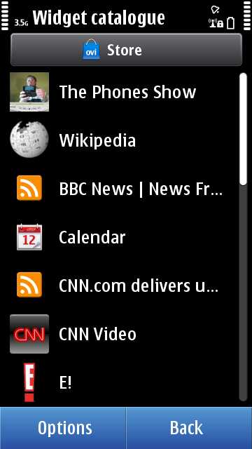
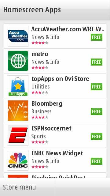
Out of the box, there are around 20 widgets included in the launch firmware (including, not shown here, Search, Social, Reuters, Notifications, National Geographic, Movie Teasers, E!, CNN and Wikipedia), but a 'Store' button at the top of the 'Add content' lists reveals another dozen or so (including AccuWeather, metro, Bloomberg, CNBC News). Which in themselves should be enough for the majority of new users, though there's a certain elegance to the way you can simply add RSS feeds ('Web feeds') and effectively make your own widgets for the site or news source of your choice in just a few seconds (once you know how, admittedly).
One oddity of the multiple homescreen system is that, unlike with (for example) Android, the mechanism to switch between them isn't on a pixel-by-pixel dragging basis. Presumably to keep the touch-recognition within widgets simpler, the homescreens are switched by executing a drag gesture from side to side. Once the gesture's finished, the homescreen slides over. Contrary to some reviewers' opinions, this isn't really 'lag' in the sense of the OS being slow, it's simply that the transition doesn't start until you've finished whatever gesture you were doing, but I can see why the current system is misunderstood and would recommend implementing a pixel-level dragging metaphor in future.
You can also tap on the 'three dots' icon to cycle the homescreen to the right, i.e. three taps and you're back where you started. The 'lit' dot shows where you are currently amidst the three. It's easy enough to understand but would be more intuitive if you could tap the dot that corresponded to the homescreen you wanted - when the number of screens gets (potentially) upped to five or more, you'll need this kind of extra control.
Contact quick dialler
One feature which has been seen in the dialler screen on only selected Nokia handsets in the past is a quick match on your Contacts database. It sounds like just a small add-on, but in practice is immensely useful, not least because the standard way of searching for a contact in the main application is so clunky (tapping on letters and watching as the letter grid keeps reducing and rearranging - it's a clever system but inelegant in practice).
The way it works is that you bring up the dialler from the 'Call' homescreen shortcut and tap out a few 'characters' of a contact or company name using the one-handed predictive T9 keypad. For example, to find Dolly Hamilton in my Contacts list, I might end up typing '4264' ("hami") and possible matches are instantly shown in a scrollable list. Obviously, the more 'characters' you enter, the fewer the number of potential Christian name, surname or company matches and the greater the likelihood that you won't have to scroll at all.
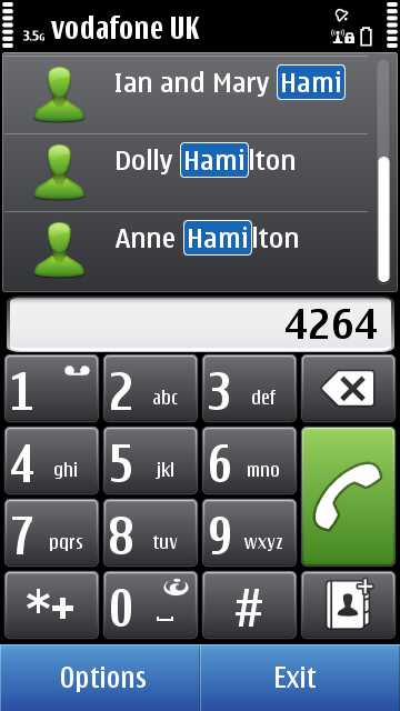
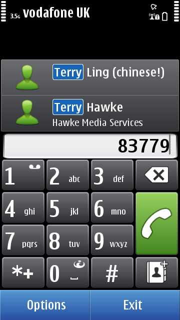
Tapping on a contact name brings up a menu of numbers registered for that person - just tap to dial, etc. Having to use a (shock!) T9-style keypad for entering a few letters of text will yet again annoy reviewers from outside the traditional phone world, but yet again it's by far the fastest way to enter the contacts dialler search clue, especially while in a hurry and perhaps on the move.
Compatibility and quirks
The majority of S60 5th Edition applications (effectively Symbian^1) should run on the N8 - I only had one which didn't, Profimail, which then got updated by its developer pretty quickly to fix the issue. It should be noted that some of these applications may bring up Symbian^1-style connection dialogs - a lot depends on how well they were originally written. As more and more developers test on the N8 and its sister devices, we should see even these legacy connection dialogs disappear and third party applications will simply go online silently, as per the components of Symbian^3 itself.
In fact, some S60 3rd Edition applications will also work without modification, again depending on implementation and any hard coded display routines. Java applications, as on S60 5th Edition, are more hit and miss, with even more reliance on developers having tested with this screen size and Java runtime version.
Overall, it's a good compatibility story though.
Plus Qt 4.6 is built into the launch N8 firmware and, going forwards, Qt will be the developer platform of choice for Symbian, spanning the upcoming compatibility break for Symbian^4, ensuring that applications written in Qt now for the likes of the N8 will also work on the next generation of Symbian hardware. Having said that, the few Qt applications in the Ovi Store for the likes of the X6 and N97 mini haven't appeared yet in the Ovi Store for the N8, so this Qt capability is so far theoretical. I suspect the imminent v12 firmware will add Qt 4.7 compatibility and then we'll see the floodgates open...
With Symbian^3 under the hood, the claim was that the old 'scroll and select' (single or double tap?) interface paradigm had been totally replaced by a direct interaction paradigm, more in line with other mobile OS of 2010. For all the core OS applications and utilities this is true and it makes everything smoother and simpler, with a long-tap on list items bringing up a context-sensitive menu of options where appropriate.
However, the N8's application set, as mentioned above, is not just about Symbian^3 itself - there are several licensed applications, none of which seem to have been updated or even recompiled for Symbian^3 and as a result they still show the old 'double-tap' uncertainty. Zip manager, Quickoffice and Adobe PDF are the culprits here and at least a re-compile by Epocware and Quickoffice would be appreciated in the near future.
____
In part 6 of our ongoing Nokia N8 review, Rafe is going to be covering its integration with Nokia's range of Ovi services.
Steve Litchfield, All About Symbian, 20 October 2010
See also the rest of our Nokia N8 review: part 1 (hardware), part 2 (camera), part 3 (multimedia and games) and part 4 (email, web, connectivity).

Reviewed by Steve Litchfield at