The full content of the book(let) is also online, so you can grab your own copy at http://www.symbian.com/files/rx/file8405.pdf. Plenty of interesting reading, with some very clearly laid out (and a few confusing...) illustrations.
The one that caught my eye was this one:
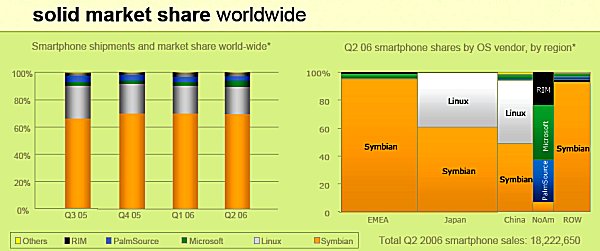
One factor that's rarely highlighted so prominently is the differences between smartphone OS market share in the different regions of the world.
The huge swathes of orange in both diagrams tell a big enough story, but note that the silver 'Linux' areas are mainly for 'closed' devices and, I'd argue, shouldn't therefore be classed as true smartphones at all. In other words, take out the silver fractions of market share and you'd end up with almost total dominance in every world market except North America.
It's trivial, from the diagram, to see why Symbian licensees such as Nokia are starting to target North America in such an aggressive way in 2006. It may only have 10% of so of the world smartphone market, but it's an influential one, obviously, in terms of perception and media coverage.
On the flip side, it's fascinating to see the sheer size of the Asian/ROW market. It's very easy to get caught up in EMEA (Europe, Middle East, Africa) figures and to keep an eye on those in North America, and to completely miss over half the smartphone world. In terms of sales figures, at least.
Anyone fancy being the official 'AAS correspondent in Japan'? Reviews, photos and insights into the world of FOMA and NTT DoCoMo would be very interesting, to say the least...