Issue 1 of Mobile Computer magazine popped through my letter box this morning. Now, it's mainly a laptop magazine, but they claim to cover smartphones to a certain extent and my eye was inexorably drawn to a group test "Get smart", in which they compare the Nokia N70 to the Samsung SGH-i300 ("Can store larg emusic library; sluggish, not for serious mobile professionals"), T-Mobile Sidekick II ("Everything you need to stay in touch; bulky, looks like a games console"), Sony Ericsson P910i ("Only for the professional") and Palm Treo 650 ("Packed with features and great software; Palm OS can be frustrating for some"). There was no overall winner picked, though the superlatives bandied about in the Treo review leads me to suspect a Palm OS fan in charge of the text.
What rankled with me were some of the comments made in the N70 write-up though, which rather give the game away that the reviewer spent only a few brief minutes with the device. Leaving aside some huge factual errors (e.g. "the N70 is bulkier than the others" when it's actually the second smallest and lightest in the review group), this next bit caught my eye:
"Nokia seems to have given little thought as to how people will use it. For example, the main menu has options for viewing pictures taken with the 2-megapixel camera and sending them to a Bluetooth printer - not something we'd use every day. Thankfully, it also has useful short cuts to a more extensive menu."
The article concluded with, under 'Bad Points':
"Keypad too small, navigation awkward and unintuitive"
Eh? I'm guessing that their Vodafone-supplied N70 had a number of Vodafone preferences set up, including 'Img print' being promoted onto the active standby screen, and that the 'extensive' menu that they're talking about is simply the main applications screen. How could the reviewer confuse the handful of standby shortcuts for the device's 'main menu'?
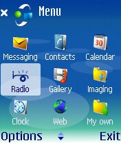 And in any case, we're talking about a smartphone here, not some trivial proprietary system which only has 10 functions that can all be fitted into a single linear menu. Like Windows or Mac OC or Linux, S60/Symbian OS is a grown up operating system with enough applications and features that folders/groups of applications are necessary. There IS no 'main menu', in the same way as you wouldn't talk about a PC's 'main menu'.
And 'Awkward and unintuitive'? My six year old daughter uses Rafe's old Nokia 3650. When I gave it to her, I spent a grand total of 30 seconds setting it up for her, making sure the six or seven applications (Camera, Images, Messaging and some games) she'd use most were near the top of the main applications screen. That's it. She then started using the 3650 and hasn't ONCE come back to me and asked me how to do something. Hardly awkward and unintuitive if a 6 year old can use S60. Hardly awkward and unintuitive if Nokia are selling tens of millions of S60 smartphones every year, mainly to non-geeks.
I know about review deadlines as well as the next journalist. But it's totally unfair to write-off S60 without trying to use it for more than a few brief seconds.The concept of application icons in various folders is simple and was working fine back in the days of Windows 3.1 back in 1990. It's hardly new and complicated. And it's trivially use to move icons around so that the ones you want are easier to get at.
How did you get on when seeing S60 for the first time? How do your partner and children cope when you hand them your smartphone? Comments welcome!
Steve Litchfield, March 2006.
See also the official S60 blog on this sort of thing