 From The Mobile Tech Bishop:
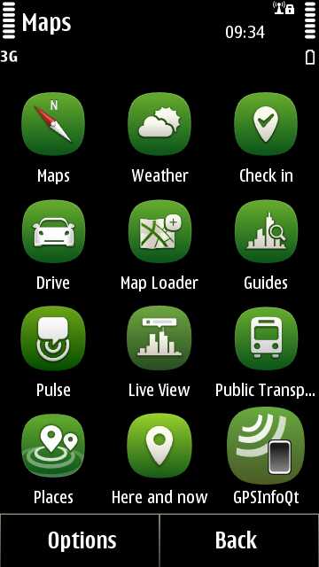
With Maps 3.08, I was actually happy that the application was broken up into different modules, initially Maps, Drive, Check-In, Update and Guides. However with the addition of Weather and now the Maps Suite, Nokia Maps is now one bloated mass with ten separate applications falling under the Maps banner. The new additions are Live View, Places, Public Transport and Pulse. Live View, Nokia’s take on the augmented reality experience, has been seen before and is still available as a standalone, but the rest are new additions to the family.
But think about that. Ten separate applications dumped into your menu. Unfortunately the one word that comes to mind is ‘bloated’, which is not how I want to look at what is ultimately the best bit of software on my N8. I have had a chance now to play with pretty much all of the packages and overall it is still the most compelling software to come out of Nokia and I believe offers one of the best mapping solutions, when looking at the sum of all the parts, in the world. It is simply stunning. However I am of the opinion that someone needs to sit the team down, take stock of all the services that make up the Maps Suite, and think about how the experience can be streamlined to make it far more accessible and friendly for the end user.
He argues that the existing ten icons could be distilled down into 'Communicate and Share’, ‘Prepare’, ‘Navigate’ and ‘Explore' and I'd largely agree - we don't want to lose some of the extra functionality but the product also needs to be clearer and simpler. On my N8, I even had to make a dedicated folder for all the Maps bits (shown right, adding in Here and Now and GpsInfo because they seemed to fit, too, making a grand total of 12 icons!).
Steve, AAS