If you wanted an example of how important mobile access is for a web service to grow, then I can’t think of a better one than the above. The growth not just of mobile devices, but of powerful mobile devices that have more computing potential than the computers I used at University (when Gopher was King), means that it is no longer enough to design the mother of all websites – developers need to be thinking holistically over the whole range of devices, from tiny screened java phones right up to HD resolution monitors on desk bound power-houses.
As websites have continued to grow over the last few years in terms of capability, they have been demanding more of the browser on the desktop. BUT - the same is true for users trying to access sites from their smartphone.
Back to those University days, the web browser I used then, Mosaic, was running on a graphics card that was running the then “big” standard screen of 640x480 pixels (only a few people could afford an XGA 800x600 monitor). And now developers are back to using screens of roughly those sizes for their mobile users.
But it’s a lot more complicated nowadays. Just a few years ago it was enough for a browser to strip out everything except the text and perhaps some small pictures, and display them. You got all the static content and information, and it was useable on the small screen.
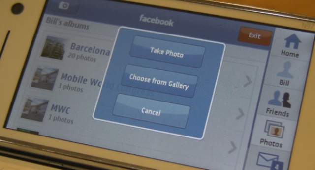
Not any more. With people demanding more from their web 2.0 services, and for websites to act more like applications than static pages, the mobile browser is just as functional as the desktop browser. And that means that the developers now have to code two major flavours of sites – the deskbound ‘regular’ version and a small screened ‘mobile’ version. Two sites that have to offer the same functionality to the end user, from registering on the site to making best use of every possible feature.
At some point in the next two or three years, the balance will change and the majority of people will be accessing the major sites, such as Facebook, through a mobile device of some description, so the work put in now will be of benefit.
I doubt that any web service that wants to be taken seriously would consider launching without having a mobile version of the site. And by that I mean a full blown, all tools available, mobile version of the site, not a mobile optimized 'highlights' package.

Yes, it is something that will cause designers and developers headaches, but is it any different than having to code for Mosaic and Netscape in the early days, Firefox and IE for the desktop, and now mobile vs desktop on a platform basis? The capabilities of the mobile browser are very much in line across Symbian, Android and iOS (with all of them using webkit in some form for page rendering), with, I’m sure, some notable tweaks on each platform to give it that final polish and creative spark.
Perhaps, indeed, we need to stop using the term 'mobile website' – these are full websites that just happen to be interpreted on mobile handsets. Their environment is different to the deskbound computer, and sites that make best use of this different environment will continue to be attractive to a large percentage of their users – a percentage that will come to dominate in the years ahead.
-- Ewan Spence, Aug 2010.