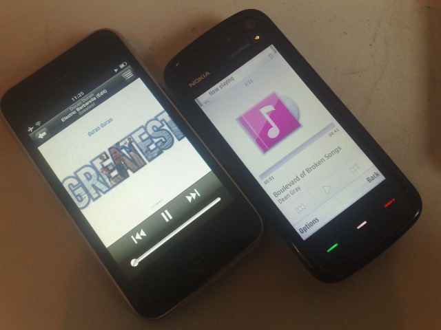
In previous times, I've been more than happy to praise the S60 Music player. Unfortunately, it has just not kept up with the changing pace of technology. On the N95 and N95 8GB vintage devices, the music app was far better than the leading MP3 players of the time, notably the iPod Nano.
Since then, of course, the iPod Touch and iPhone have arrived with an interface designed for a larger-screened device. The Nokia 5800 added the touch capability, but Nokia has now, in my mind, lost pole position as the best UI for listening to and navigating your music. What could it learn from the iPhone UI?
Kinetic Scrolling
A flick of the finger and the track list on the iPhone whizzes past, slowing down to an eventual stop. After a few uses, you can get a pretty accurate flick, at varying speeds that takes you to where you want in a list. The scroll on the 5800 means either holding down just below the edge of the list as it trickles past or dragging a scroll handle. Navigating a huge list via scrolling and looking is not a strong point on the 5800.
It's notable that one app on the 5800 (the Twitter client Gravity) has implemented kinetic scrolling - and it's raved about in every review. With the N97 looking to have this activated in the web browser, perhaps we'll see it come to scrolling lists in other applications very soon.
The Headphones are not Fashionable
Actually, neither device scores highly in the headphones front – those that come supplied are of pretty poor quality. I have a little bag of all these unused headphones that have been replaced by a Sony design that I've favoured for years.

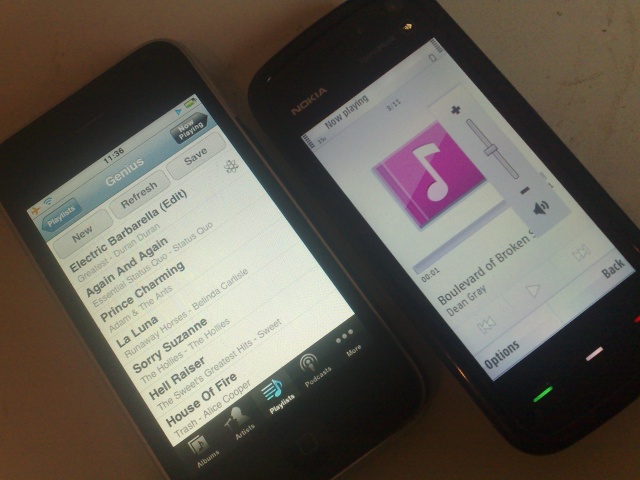
Genius Function
This feature has grown on me. It's rather like an intelligent shuffle. The iTunes App calls back to the iTunes Music Store with the music you listen to, and through that it works out what songs are 'similar' in your library. So when you are listening to, say “Rio” by Duran Duran on the iPhone, tapping the Genius icon generates a playlist of songs on the phone that are a bit like that, that you like. In my case it came up with music from Pat Benatar, The Sweet, The Human League and Kenny Loggins. Perfect for me!
Granular Volume (with limiter)
All told, the 10 steps of volume that the Nokia's have is just not accurate enough for my liking. The very small steps between volume limits, giving an almost analogue feeling, was something that the iPod Nano had that I loved, and it's still there on the iPhone (admittedly only if you use the touchscreen – the side volume buttons step through the whole range in 16 clicks).
More text on screen (and album art in lists)
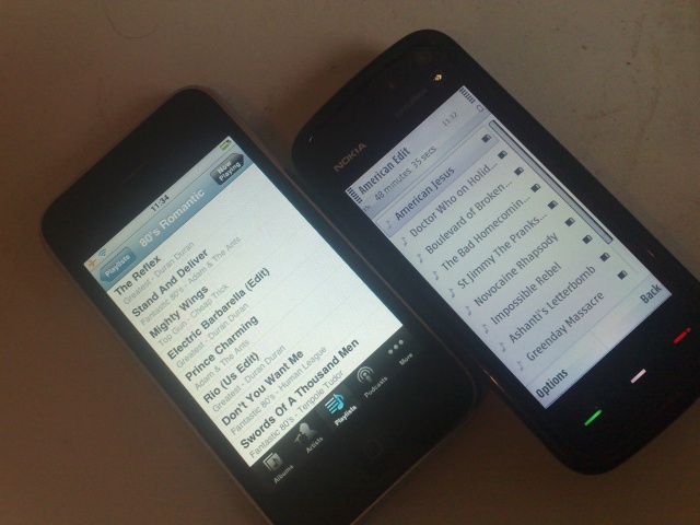
On any of the text lists, the 5800 can show nine lines, which is actually one more than the iPhone display, but the iPhone actually shows you more information. A solitary album name is all you get in the 5800, where the iPhone shows not just the album name, but also the album art and artist name. By using a smaller font (and by virtue of a wider screen) there's more information on display, and that gives the feeling that you are seeing more albums at once.

It's just a lot easier to navigate the lists on the iPhone both from its physical interface, but also in terms of information, differing font sizes, giving your eyes the ability to pick out the information almost subconsciously.
Quick Linking to other Filters
Along the bottom of the iPhone screen are links to four areas of the app – you can customise these, but I have Albums, Artists, Playlists and Podcasts there. I think that would be the same for most people. The 5800 asks you to go back... back... back.... to the top level and then drill back down again into your chosen category. Nokia, that's a fail on speed of access and customisation.

Podcasting Support
To be honest, neither music app does podcasting very well – both of them pass over the duties of collecting and downloading podcasts to another application (iTunes Store on the iPhone and Nokia Podcasting on the 5800), but I will shade Apple's implementation very slightly, because playback can happen in only one place – the music app. On the 5800 you can listen either in the music app or in the podcasting app. While I bet the OS uses the same 'process thread', it shows up in the mind of the user in two places. That's not good for UI or simplicity at all.
Song Ratings (and sync)
Just a minor one here, but with the iPhone so tightly tied to iTunes, the syncing of meta-data such as Album art and song ratings (the stars out of five) are comfortably passed between the two devices. Album art added to MP3s doesn't always come through on my 5800 [nor on mine - Ed], and forget about the star ratings transferring through to, say, Windows Media Player. That's not going to happen!
Operation Under Keylock
There's a logical symmetry of having the keylock on the Nokia 5800 stopping everything working (that, after all, is the definition), but when playing music and with the smartphone in my pocket, while I do want the screen locked, I'd like the volume keys to still work. And yes, this is an area where the iPhone does it right – touchscreen off and two buttons needing a decent press to change the volume.
A Final Thought
To be fair to the Nokia 5800 Music player, it does a lot of things right. Such as the search function, and quick access through the media bar. The iPhone could learn a thing or two as well, for example from its ability to organise playlists on the device without having to resort to the desktop iTunes client. Each music client has bits that I would lift to make the perfect mobile client. I wonder who will make the firmware changes first?
-- Ewan Spence, April 2009
