 Introduction
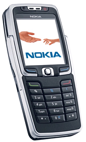
Much as with the E60, the E70 initially strikes you as a rather plain, standard phone. There’s a screen at the top, sensible buttons at the bottom, a camera lens on the back, and not much else. What’s fantastic about this phone, and why it's in the Nokia E (Enterprise) series is what’s under the hood (literally) and the mode of text entry. While you might be a T9 whiz, not everyone is, and the Blackberry-toting businessman has his two thumbs perfectly placed to type really quickly on a small but functional keyboard. And while the E61 form factor replicates the Blackberry, the E70 is more subtle. Sure, it has the classic candy bar shape, but then…
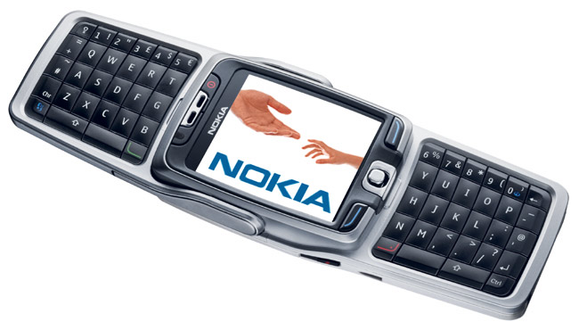
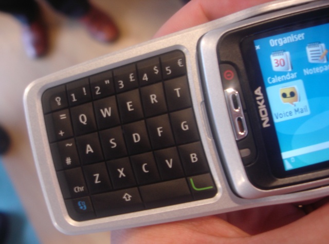
…hinge up that keypad, like the gull wing doors on a DeLorean, and you’ve got yourself a full keyboard. In addition, the high resolution portrait screen switches itself to landscape mode, reconfiguring the applications to take account of the different space and controls. It’s very, very swish, and lifts the E70 out of the crowd of ‘standard’ smartphones to something pretty special.
It’s also not gimmicky. This gullwing/split design has appeared before, in a Series 40 Nokia phone, and it obviously went down well in the focus groups. With slightly domed keys (more than on the 9500, but not by much) it’s pretty accurate but you can’t really push the speed – your thumbs can only move so fast. What is noticeable, and not easily cured, is that the phone is geared towards the right-handed people of the world. There’s only one way to hold the phone in “open” mode, and the phone cursor and soft keys snuggle up to the right hand side of the screen. There’s no easy solution, but it can make the phone awkward for left handers. What’s nice is the automatic reconfiguring of the screen. When you open the keyboard, the applications re-jig their layout, menu and buttons to make full use of the UI.
The Visuals
The camera lens isn’t directly exposed, there’s an extra plastic lens over the cover, which doesn’t interfere too much with the picture quality. The housing is pretty much in the centre of the unit, and that unfortunately means that when holding the unit your index finger is curled round the back and naturally covers (and smudges) the lens. The pictures themselves are a maximum 1600x1200 (2Megapixel) resolution and you’ve also a choice of video formats to use, from the Nokia H.263 3GP to MP4 and H.264. On the other side, we have the by now standard 352x461 high resolution screen, which can display up to 262K colours.
Calling Out Around The World
Under the hood, there’s an impressive choice of ways to communicate with the outside world. GSM and GPRS are to be expected, and 3G is also present – given the number of networks that will be offering this from the expected 2006 launch date it makes sense to keep the Enterprise phones as forward-compatible as possible. The big killer feature, of course, is Wi-Fi. It means the phone is equally usable as an email client, web browser or VoIP device when you’re in range of a hotspot. The assumption (rightly) is that most owners of the E70 are going to have ready access to a Wi-Fi hotspot, either at work or at home.
A lot of this is due to the underlying operating system. Symbian OS 9.1 is the big change here, and throughout the entire S60 UI you can see that there’s a massive number of new ‘features’ due to 9.1. One that isn’t as noticeable, but is going to be genuinely useful, is that you can have more than one connection open at a time. Previously in S60 phones, if you were browsing over GPRS and you then received a call from someone, the GPRS connection would be dropped. So if you had to look up an online map while chatting, you couldn’t. Well, now you can. You can run a conversation, a GPRS packet connection, a Wi-Fi connection, and be connected to the PC Suite for data access, all at the same time – with different applications using different connections. Try that with any rival smartphone OS...
Simple But Effective Changes in Messaging
Rejoice! Thank you Nokia! If the only change in the Messaging application was being able to see ten (yes ten!) message headers on a single screen, then I’d be happy. Luckily there are more changes under the hood, but that’s the one for me. I’ve been shouting for this since my 7650 and to finally see the screen dimensions used to present more information is the biggest single change in S60 v3. Messaging has had a lot of work done to it. On running the email set-up wizard (which makes it a much easier process to set up an account, compared to the old massive dialog), you get presented with three options. IMAP and POP3 are now joined by an option called Sync, which allows access to a number of email services, such as Blackberry Connect, Nokia’s own Business Centre, Visto, and others.
Otherwise it appears to be business as usual, but with the gull winged keyboard it’s much easier to get text into the E70 than using just T9 (on something like the E60). Text entry is helped immensely when using the landscape mode and with the keyboard open. The other great feature is that each email account is no longer tied to a specific Internet connection. When you open a box and ask it to connect, it will do a quick scan for an available Wi-Fi network, and present you with these to choose from, along with all your configured GPRS, GSM and 3G data connections through your network provider.
Brand New Web
It’s still early days for the new Browser technology in S60, which is based on Apple’s WebCore elements (which is the basis for their ever-popular Safari browser). It’s a big jump up from the XML browser that previous devices have carried (although many of them were also bundled with Opera) and there’s a huge amount of functionality. We’ll be looking at the Web app in depth in a later article, but the most important things to point are that this is an incredibly mature browser technology. There were no problems logging onto my digital banking account, thanks to SSL support for secure sites.
Rendering pages is, not surprisingly, on a par with Safari, and it handles complicated pages smoothly and at a decent speed. What appears to be missing, at least in this pre-release, is a way to 'squish' screens to the width of the E70 screen in the same way as Opera’s small screen rendering does. I hope it’s on the 'features to be added' list, because while some well coded sites can happily work in the constrained width (even in landscape mode that’s only 416 pixels), there are noticeable exceptions.
Luckily, the browser has a nice way of handling pages – you can see a ‘thumbnail’ of the entire web page, and a small boxed ‘cursor’ that shows you which area of the page the screen is showing. It’s a great idea, but not one that should be relied upon on its own. The ‘full page’ thumbnail technology is also used in the history view. Rather than have a list of page topics to scroll back through, you get to see the thumbnails of the page. A bit disorientating the first time you use it, but otherwise a great UI touch.
In a nutshell, that sums up the browser. The nuts and bolts are there and working, but the UI throughout the entire app still needs work before a release in late Q1/Q2 next year.
The Desktop and Core Apps
The S60 main screens have proved themselves over time as a good way to get to the applications, so the changes here are minimal. You now have twelve icons on the screen in a 3x4 line-up (increased from nine), and a nice touch is that if an application is open and running in the background, a small ‘open’ logo appears by the icon. This is a nice visual indication to both show what is going on and also emphasise the benefits of the multitasking OS.
Flipping open the keyboard brings an immediate switch to a 4x3 grid of icons, with soft-key labels at the top right and bottom right of the screen. Your battery power and reception strength meters sit in the opposite corners. There’s full theme support, and the screen is the high resolution 356x416 size that, while taking up the same space as previous S60 screens, has double the pixels in each direction.
The organiser (PDA) components of S60 are still present, with a Contacts manager, Notepad, To Do list and Calendar. In the firmware supplied with our pre-release device there were no functional difference to that of the PDA components in the last feature pack of S60 v2.
The standby screen has become more and more useful as S60 evolves, and on the E70 it’s proved even more useful than on previous models. Just as with feature pack 3 on S60 v2 (seen on the N90), you still have your two ‘quick launch’ applications on the soft keys, and you have five shortcut icons that you can set yourself to any application or to a number of commands (such as 'New SMS'). Finally, you have an overview of your PDA applications, so your Inbox status and any appointments on that day are on the screen. This functionality is going to kill a number of third party applications, or at the very least force them to raise their game.
The Third Party Problem
And here's where it gets interesting. While it's easy to move information such as your contacts over to your phone, you can forget about any of the third party applications that you may have built up with over the years. It's not as simple as having to get a new registration code from the developers, because the change in the Operating System to Symbian 9.1 means every C++ application needs to be (at a minimum) recompiled, but will probably need to be re-written, to some degree. Nokia have given the developers something close to six months to prepare for this, but it's going to be interesting to see if favourite applications get re-coded, or whether we see new candidates to replace them. S60 v3 and Symbian OS 9.1 also sees the new security model in place. Again, an issue that we'll be watching with a close eye as these devices come closer to getting into public hands
Rounding Up The E70
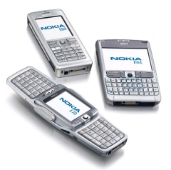
The E70 fits nicely into the range with the standard candy bar E60 and the Blackberry-like E61. It's got the appearance of a standard phone, but the gull-wing keyboard gives it a much better text input method than T9. There's a huge amount of promise here and, while the hardware is pretty much spot on, the software naturally needs to have the bells and whistles added to what is a pretty stable build of the latest version of S60. I'm looking forward to seeing the release version already.
There's thanks all round in these articles, as we've had various departments of Nokia helping us out with the loan units. You all know who you are and it's much appreciated. Thanks also to The Stig and Penrillian for some rapid application development examples.