Review: Opera Mobile 10 (beta)
Score:
85%
Ewan Spence looks at the 'new' native S60 web browser, currently in beta....
Version Reviewed: 10.00 beta
Buy Link | Download / Information Link
So how do you go about reviewing a web browser in the modern internet world? With so many services on S60 smartphones now coming wrapped up in their own little slice of code that talks to the web API's, my first challenge was to actually think about what I still use the web browser for? It's not Twitter, as the Gravity client handles this better than any web interface... It's not Gmail, as Google provides a more than competent standalone client (and Ovi Mail handles it nicely as well)... So how much time do I actually spend on my mobile phone's browser?
It doesn't matter to be honest. What matters is that when I do head to the browser, it gives me information and it presents it in a suitable way for mobile. A huge number of people believe that you need to have a perfect copy of a page that gets rendered on the desktop. I'm not one of them – as long as I get the content in a usable form then I'm happy. But others are looking for a desktop-like experience and that's something that every mobile browser struggles with.
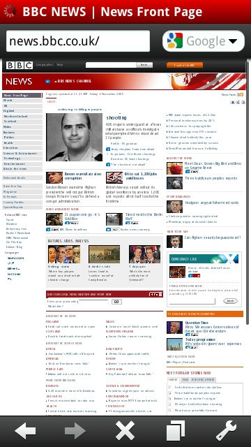

Good old BBC News - full on the left and low bandwidth on the right.
Like any browser, Opera Mobile does some things better than others - and some definitely poorer. Thankfully Opera Mobile is currently free (and we'd assume it stays that way when it leaves beta as well), so it is worth giving it a spin to see how you get on with it.
So let's start off with my most frequently used page on a mobile device: BBC News. On opening a new tab for browsing, Opera Mobile presents you with up to nine thumbnails of quick links (think speed dialling). Three are pre-filled by Opera themselves, BBC News and Wikipedia. But I'm not using this link, I'm heading to the low bandwidth version at http://news.bbc.co.uk/low, partly because it clears all the cruft and rubbish out the way, but also because I've been using it for years and I'm far more comfortable browsing this way.
It's also a useful test on a mobile browser in how it handles text and zooming – key elements for a small screened piece of software. The text is a single line, with no formatting applied to it by the BBC, so what will the browser do? Well the Nokia Browser will just wrap it at the required zoom level, so handles it best of all. Opera Mobile betrays its main benefit in getting all the text into one readable column on the far left, which means a tap and zoom will take you right to the text. You will be zooming in and out constantly from the page overview to readable text, and back again as the text is wrapped to a maximum width of one zoomed in column.
(Oh and if you want a comparison, the iPhone Safari browser has a delightful flaw in that when you zoom in on the text, it doesn't re-wrap. So it's not all perfect on every device, okay?).
But this is the strength of Opera and how it handles text on pages. A tap anywhere on a loaded web page will 'zoom in' on that section. If it is seen by the Opera rendering engine as a text column, then it will be the width of the screen, leading to a pretty easy reading experience. All you need to do is scroll down. Tap (but not on a link) or hit a soft key and you'll be zoomed out again to see the full page.
One last point raised by Auntie. Using the Nokia browser, when I click through to the “full” BBC News website, I actually get the BBC's version of a mobile friendly page – not the full page. Which is a nice idea but takes the choice out of my hands. Opera on the other hand delivers the regular page that I'm used to from my desk-bound computer.
Entering data into web forms is not the strongest of points for any mobile device, and here the keyboard on the E75 shines through. The touchscreen on the 5800 gives Opera a chance to use their non-standard on-screen keyboard rather than the one built into the device. This is a missed opportunity because people will feel that the Opera solution is just 'wrong' rather than different. I suspect the reason is that Opera can keep the same code base over multiple platforms, but not using the built-in input options is one area where I think Opera have made a mistake.
One other addition to Opera Mobile's arsenal is copying and pasting from web pages. By using the built in S60 clipboard (hooray!), you can highlight text from any web page (by holding down the stylus or action key to switch to cut/paste mode) and take this to other applications. Of course, the chances are you'll have to close Opera to get enough RAM to complete the paste (more on that in a moment) but it does work and is another function that the Nokia Browser could do with.
What next to throw at Opera? “A-ha,” I thought, “lets try internet banking.” In my case, the Royal Bank of Scotland (yes we still have it... just). Nokia browser? A nice blue bar at the top of a white blank page. Opera? The page as I expected, logging on and letting me see just how much money I don't have. There's something Opera manages that the built in web browser doesn't – although I only check digital banking from home, on my own Wi-Fi, it's nice to know it works.


Opera Logs onto RBS nicely - Nokia's Browser can't reach the login screen.
Probably the geekiest test for Opera Mobile is the ACID3 test (http://acid3.acidtests.org/) – this is a web page that is deliberately complicated to see just how well a modern browser can cope with modern trends such as XML, vector graphics, data URI's and other strange magical ingredients. Put together by the Web Standards Project, Opera Mobile does remarkably well, scoring 92 passes out of the 100 tests and getting very close to the reference image. Nokia's Browser manages 47 and is nowhere close to getting the coloured boxes right.
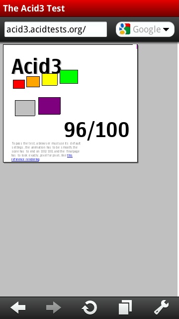
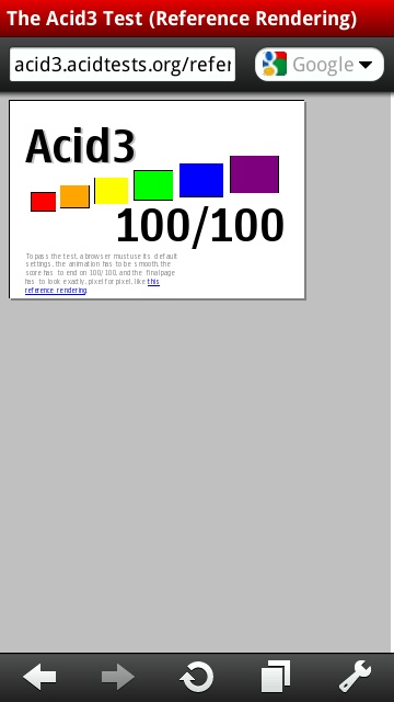
Acid3 test - result on the left, what it should look like on the right. Nokia's result below.
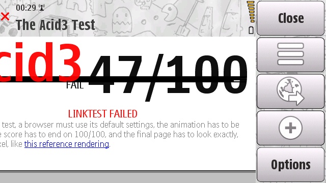
So Opera Mobile works? Yes, undoubtedly. Are there flaws? Of course there are... with an infinite number of web pages out there, it's tough to get everything right. The biggest issue I found was on blogs and social websites (such as Facebook), where comments to previous messages are indented. Those indented comments stayed at the same width as the original comment, but because of the indent the end was just off screen.
It's the one time I had to do side to side scrolling while zoomed in. And for those of you asking, yes there is a touch of kinetic scrolling here on my 5800 and the 5th Edition phones. I'm not sold on this though – it's fine when the column of text is on the edge of a screen, so you can flick/scroll slightly out of alignment to vertical and not notice it, but on sites with text in the centre, such as All About Symbian or Facebook, the flick scrolling needs to be super accurate or the page does just enough scrolling to the left or right to have the margins slip out of sight.
I'm not super accurate.
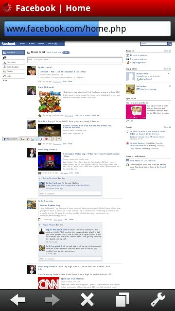
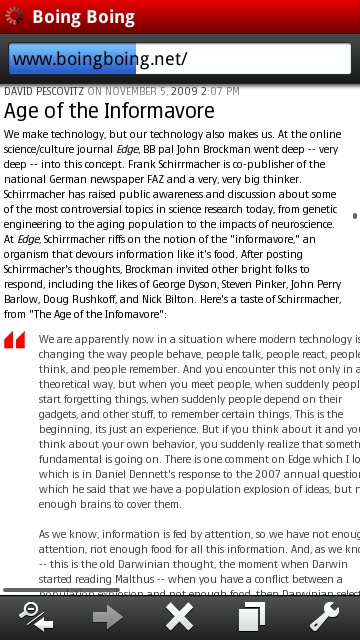
Facebook and Boing Boing showing the indented text column problem.
One thing to congratulate Opera on is that there are subtle changes in the UI, depending on whether you are running on a touch enabled 5th Edition deviceor a key based 3rd Edition device. Driving a web browser is something that is naturally more suited to the touch interface (here running on the 5800) but the button only devices (which are likely more prevalent) can definitely hold their own, and in some respects a good cursor pad on a mobile is far better than having kinetic scrolling.
It's also consistent. The 5th Edition Browser on Nokia is a strange mix of regular soft keys and menus, or the grid of 12 icons for popular things you want to do. Switching between the two is jarring for me, so for the user experience, Opera Mobile comfortably wins simply because everything works the same way.
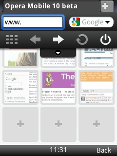
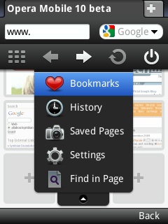
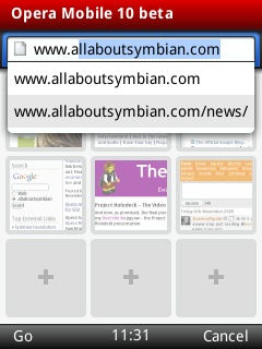
Across the top of the screen you have your title bar in Opera's trademark red, and below that the now familiar URL bar and Search. Selecting either and it expands to fill the whole line. Opera bring up its own on screen keyboard for touch devices, while on 3rd Edition phones this is hidden (to save screen real estate) but tap on the left soft key (marked 'menu') and up it pops. This is also where the icons that sit at the bottom of 5th Edition can be found on the 3rd Edition version.
On both styles, these icons give you access to the expected browser controls, such as forwards and back (which doubles as a zoom out when you've tapped to zoom in), and the reload button if you sit on, say, the front page of a news site.
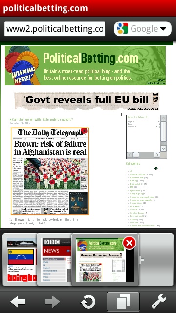
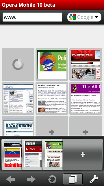
On my E75, the next buttons are for the thumbnail view and exiting the program. The thumbnail view is a great idea - with nine slots to put in my favourite sites, I've not yet filled them, yet Opera is taking me to most of the places I want to go while browsing. That's a good UI. Tweaking your settings hides under the menu option on the E75, whereas on the 5th Edition 5800 it replaces the exit button, while the last icon is switched around to be the Tab Switcher.
This is where Opera really scores over the Nokia Browser, in the manipulation of multiple windows. Rather like a hand of playing cards, one tap will show you a fan of the open tabs – each with a red 'X' to allow you close that tab if needed (hmm, that sounds familiar). You can shuffle these around and bring a window to the foreground, and that's mirrored in the main browser window. It's a simple to understand way of doing it, it looks and feels intuitive, and like much of Opera Mobile, it just works.
There's always an empty window on the far left, and it's here you tap if you want to open up a new tab – which brings up that thumbnail view on the screen for fast access, or an empty URL bar if you want to go somewhere new.
A nice touch in the URL bar is that it is always pre-populated with "www." , which saves a bit of typing and hunting. As you type, be it on a keyboard, number pad or using the hunt and peck keyboard, Opera looks to see if you typed a full stop. If you have, the most common domain endings (.co.uk, .com, .org, .net) are listed below the URL bar for a quick tap to save you typing it out in full.
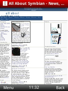
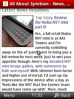
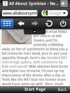
Like any good web browser, there is a full screen mode, which hides as much of the screen furniture as possible. To be honest, I've not felt the need to use it because Opera is already hiding most of the buttons anyway – just a small bar on the 5800 and everything under a menu key on the E75. But when you need a few extra pixels, it's a nice option to have.
Opera Mobile is not without faults. For all this preening as a full desktop-like experience, it also has the same faults as deskbound browser... it eats memory. If you're hoping to have some background music playing on your phone while you browse with Opera, then think again. Opera Mobile is a return to the day of one app running per phone. I'll give it a touch of leeway as it is marketed as a beta version – but the first thing I'll be checking when it reaches a full release is if I can read Whitesnake's Wikipedia page while listening to “Here I Go Again.”
But I like Opera. It does what it sets out to do, to give you a full web browser. It handles more sites and activities than the Nokia browser, and I just prefer the way it handles text and tabbed browsing than the built in choice. Being a free download, there's no reason for people to not try it out.
It's not a mega-app... not yet. It's definitely recommended, and I'm going to be keeping a close eye on Opera to make sure that a full release candidate does arrive in the next few months. Right now though, it has replaced the Nokia Browser in my morning routine for checking the news, weather and the world, and I think it will be the same for many of you.
-- Ewan Spence (Oct 2009).
Reviewed by Ewan Spence at
