Review: Aqua Calendar
Score:
83%
Version Reviewed: 5.12
Buy Link | Download / Information Link
 Having already given time to the first Calendar replacement on S60, Papyrus, it was only fair to have a look at the next big competitor, Aqua Calendar. As with Papyrus, Aqua Calendar is available for a number of Symbian platforms (S60, S80 and UIQ), but unlike Papyrus it is not available on other mobile platforms.
It provides pretty much the same functionality as Papyrus, to provide a Calendar system that gives the power user as much flexibility as possible, and it has a similar interface, but in fact it has more options and views.
What I like though is that not all of these are immediately on display. When you first open Aqua Calendar, you are presented with an overview screen, and from there the right soft key will cycle through a day view, week view and a month view. There are another five screens that you can view though, including alternate day and week views, and alternative ways to look at contacts, tasks and messages.
It’s important to stress that these are only initial choices by the designer, and you can customise which views are handled by the button to scroll through, although having the initial choices limited, but still providing tons of functionality, is a good call by Pocket Torch.
The overview screen is a pretty good substitute for the main S60 active standby screen. If there was a space to add in shortcuts to other programs, I’d be clamouring to have this replace the standby screen, it’s that good. I love the fact that everything can be expanded or closed, just like expanding a folder view on a file manager.


On to the other three default screens. The Busy View is similar to those one week per page diaries, and gives you a traditional look – which works well on the larger screen but feels a touch cramped on the earlier S60 devices with 176x208 sized screens. It’s actually one of two busy views you can choose, the other is similar to the built in Calendar and shows the week as a strip chart of time, simply blocking out by colour the times you are busy with no text. Perhaps the small screen devices would be better having this view as a default? In any case it’s easy to change over in the preferences (more on that in a minute).


The Day view also gives the choice of viewing either on an hour by hour basis, where you have all the hours of the day listed and your appointments in the correct place, or a compressed view where only your appointments are listed sequentially, with no gaps to give an indication of time. I much prefer the former view here, as the latter gives me no indication when a day is free – a simple ‘No Appointments Today’ message would be more useful than a blank screen… at first I thought the application had crashed.
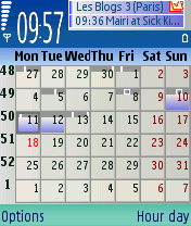
The final default is the Month view – as with Papyrus, there is a mini-busy bar on the top of each day, and when your cursor is over a day, if it has entries, a mini-busy list appears in the top right corner, along with a handy list of icons to show if it is a task, has an alarm, or an extended note.


Other views you can access from the menu, or add into the ‘loop’, include a view of people’s birthdays (if you have this data in their contacts entry); a list of all your contacts, which is actually quite useful, given it uses a very small font and a lot more names can be fitted on the screen – you all know I love applications that use small but readable fonts to get more info on the screen; and a separate screen showing you your Inbox. What I liked about this is that it shows messages received on a single day, by scrolling left and right you get a timeline of your texts, as opposed to one long list.
All these views are great, and give you a lot of flexibility in how you view your data, and any one of them will suffice for a quick glance, but where Aqua Calendar scores over both the built in Calendar application and Papyrus is when you enter or edit an entry. It’s a tabbed screen, so the first panel has simply the text, start and end times and the date to edit. Shifting left and right with the cursor reveals the extra information you can edit, for categories and alarms, repeats and extended notes. Tucked away to avoid confusing the new user, but still easily accessible for the power user – love it.
It’s also worth pointing out just how comprehensive the preferences screen is – from the basic user settings, to the colour scheme employed, there are 12 tabs of settings for you to explore if you feel the need to tweak Aqua Calendar. It says a lot that the default settings are pretty smooth, but there’s still room for a personal touch.
I see nothing wrong in Aqua Calendar, it’s a smooth piece of code, it’s very stable, and it adds the functionality that is missing from the built in application. Aqua Calendar is definitely recommended as a great piece of software.
Of course, the bigger question is which calendar app (Papyrus or Aqua Calendar) comes out on top – I’ll answer this in detail very shortly.
Ewan Spence
Dec 2006
Reviewed by Ewan Spence at