Review: Papyrus
Score:
80%
Version Reviewed: 1.3
Buy Link | Download / Information Link
Long ago, the Psion Series 3a arrived, and with it came, arguably, the single best Calendar and diary program ever. That’s not on a PDA or smartphone, that’s on any platform at all. Sure that’ll draw criticism, but the subsequent tweaks of the application, right up to the Series 5mx are still relied on by many people (even some of the Symbian board) to this day.

Papyrus working on both the E61 and on the N91...
Why is this important? Well it’s like owning a Rolls Royce car, and then throwing it away, never to be seen again, because you’ve got a little Volkswagen Polo that’ll take you to the shops and back. Symbian own the code to the old Psion (EPOC) Agenda application, it’s just that we’ve never seen anything approaching the old gold standard since the OS was relabelled Symbian. [Ed: well, Calendar on Series 80 was based on EPOC's Agenda, though I'll grant you the smaller screen and silly font sizes didn't do the code justice...] [Ewan: and the engine in a Lada Riva was from the VW Golf... the implementation tweaks on S80, quite frankly, ruined it...]
Which is where the third party applications have had to step in. Can they bring us a powerhouse PIM package? Papyrus, step up to the plate.
And then promptly stagger under the weight of an absolutely massive install with 1.4MB of storage required. Yikes, that’s rather a lot. Is it worth it?


On running Papyrus, you can cycle through three views of your Calendar data, 'Grid', 'Month' and 'List'. These are all on the right soft key - which is normally reserved for back/exit in the style guide. My suspicions are that because Papyrus is a multi platform application this is (a) leading to a lot of bloat and (b) the soft keys are following the Windows Mobile style guide rather than Series 60. Sigh.
The Grid View presents you a week on a single page. And one of the biggest advantages of Papyrus over the built in S60 Calendar is the font size. The default is small, and that means that, even showing two columns, you’re able to see enough of a diary entry to make sense (or at least jog your memory). You can also see the default colour scheme. ‘Today’ is show in yellow, green is the weekend, and blue is your cursor. Left and right advance the cursor per day, while up and down will skip a whole week. It’s fast, if not entirely intuitive.


 It’s just a shame there isn’t a separate To-Do view that actually works – it’s one of the few things I miss from the Palm OS or Windows Mobile devices, which is a truly flexible, integrated To-Do system that preserves categories. Speaking of categories, you can use them in Papyrus, but they didn’t export back to Outlook, for me at least.
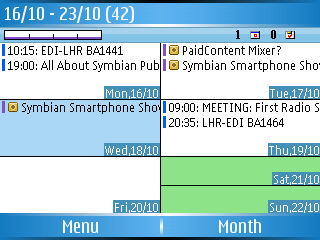
This icon strip is also used in the 'Month' view, but it also appears on each day where you can have an appointment. That means you’ve got an overview of up to 31 days, and at a glance you can see when you’re free. It’s clear, easy to understand, and even on a 176x208 screen the sheer usefulness of the information pouring out here is exactly what I want. And when you cursor over a day you get a detailed view at the base of the screen.
 Finally, the 'List' view, which is very similar to the day view, but which lets you keep on scrolling through a continual list, with each day having a small header bar as you scroll down. Strangely enough, this isn’t as useful as it sounds, but it’s still a welcome addition.
Where Papyrus stumbles is in adding in new entry. It has a horribly clunky moment as the S60 dialog is called forward. There’s a noticeable stutter in the program, and it's a shock going from screens which can cram in a huge amount of data to the standard S60 dialog. If SBSH were happy to break the style guide over the soft keys, I wish they had done the same with the dialogs and implemented them in their own way.
Is Papyrus a good replacement for Calendar? Yes it is. Is it the gold standard? Unfortunately not, but it’s a darn site more useful than what's built in. It has also had a good number of updates, showing an application that is still alive. It’s still not perfect, a bit more moulding to a S60 style guide would make the learning curve a little easier.
And it has a nice small font, which makes me happy. Recommended.
Ewan Spence, AAS, 14 Nov 2006
Reviewed by Ewan Spence at