Review: Nokia X6 Review: Part 1, Styling and Physical Presence
The first part of Ewan's real world review of the Nokia X6 Comes With Music....
Buy Link | Download / Information Link
So here comes the X6. As the de facto sequel to the surprise hit of the 5800 XpressMusic, the X6 has a lot to live up to in the eyes of the media and the consumers. Actually, being honest, a touch screen device, with music support, operator backing and a stylish black look such as the 5800 had all the indications of being a successful device even before launch. Shall I cut a long review short and simply say that the X6 doesn't (yet) manage this, but if Nokia apply themselves, it could do so in the future?
And now, the longer version, over multiple parts.
The X6 doesn't have the first mover advantage of being Nokia's first touch screen S60 device, but you can't help but fail to notice the biggest change in Nokia's touch screen devices with the X6, and this is the switch from a resistive touch screen to a capacitive touch screen. No more stylus needed (or in fact, able to be used), the X6 screen will only pick up on the touch of human skin on the screen (normally your finger).
This has an impact on the S60 UI, and I'll come onto that in a subsequent part, but in general this change to the interface has made the X6 a much more tactile and gorgeous device to handle. You don't need to struggle with a stylus, aim a fingernail at the screen, or even be pixel perfect accurate – a glancing stroke with a finger or a thumb swiping across the screen is more than enough to have your touch picked up and acted on.
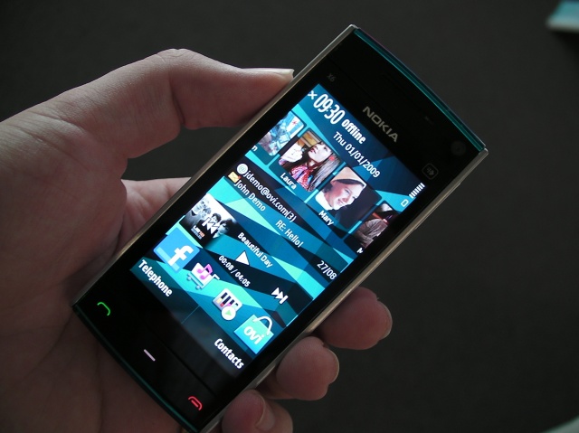
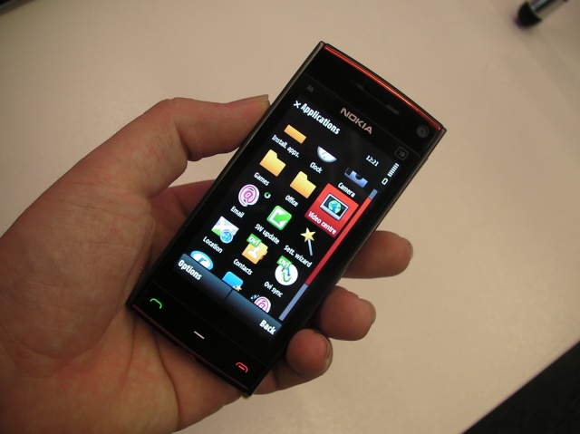
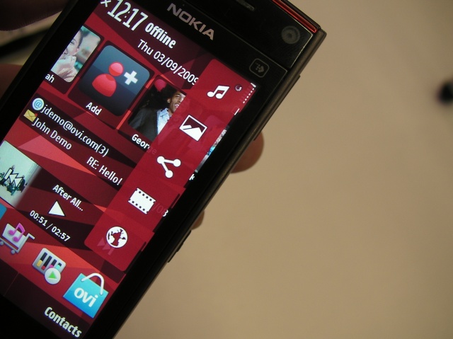
Just to give you a heads up that the S60 5th Edition changes in the X6 lack one word – consistency – but this is nothing to do with the physical hardware of the screen. Not only is it excellent and responsive, but the colours and sharpness give the X6 a wonderful clarity; I'd go so far as to say that it demands to be held and touched.
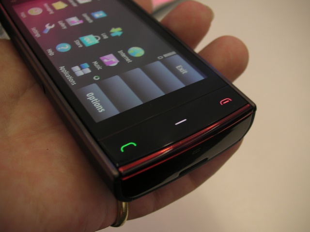
Also on the front of the machine are the call/end call/app buttons. Unlike on the 5800, which had these as three raised buttons, a strip of plastic that takes up all the space at the bottom of the screen carries the three buttons here. Rather than being touch sensitive, this is a physical set of buttons where the whole strip pivots slightly depending on which button you press. It suddenly takes away from the glorious screen and dumps a cheap plastic phone back in your hand. Not good mojo.
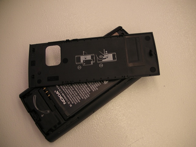
This bendy and cheap plastic feel also applies to the back cover. It's a single sheet of moulded plastic, and instead of slides, catches and runners to hold it in place, you just bend it up at the bottom edge and pop it off. It makes for a smooth construction (and lower production cost) but again, adds to the tacky feel of the phone.
And then you have a SIM card slot cover which is little more than a plastic wedge over a push in slot – there's nothing seamless or tactile about these buttons and covers. Okay the SIM slot is a thing that the average user might only use once, but it has an impact on perceptions of the machine.
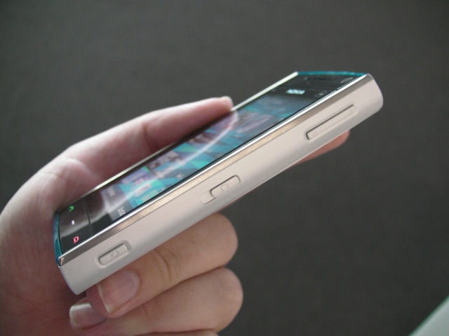
Which is a shame because the X6 is more stylish than the 5800. With the two long edges nicely curved, it sits comfortably in your hand, while the slight off-vertical surfaces at the short edges give an almost trapezoidal shape. The curve fits my hand, it's easily picked up from a table,and perhaps my only complaint is that with no lip around the screen (as the 5800 has) it's very easy in this thin candybar format to have your fingers stray into the touch screen area.
Right then, let's address the biggest issue I'm having with the X6 – and it's a physical problem. The key-lock slider on the side of the unit, which unlocks the touch screen has two problems. It's far too stiff and the sliding key needs far too much pressure when pulled towards the base of the unit to be at all comfortable. Also, unlike the similarly functioning key on the 5800 which was heavily ridged, there's a tiny raised padlock symbol which gives almost no purchase on the key. This is a backwards step from the 5800 and one that seems to be more a lack of oversight than anything else.
Yes, there should be some style, but this is a step too far.
The top edge of the X6 carries all the connectivity and power options. There's a microUSB connector hiding under a plastic grommet that seems securely fixed to the X6 body, the 3.5mm headphone/headset socket, an charging socket and the power/profile button. That button seems to have a huge amount of play before it actually does anything, which isn't particularly reassuring; and the inclusion of the charging socket is required as the X6, amazingly, does not charge over USB.
The volume buttons and camera buttons are in the expected place, on the right side with volume at the top and the two stage camera shutter button at the bottom. This is Nokia's design language and not something you would expect to see changed. What's interesting is that these two buttons are a different style to the key lock and power buttons. Much like the software of the X6, the outside seems to be two different ideals running into each other and compromising as best they can.
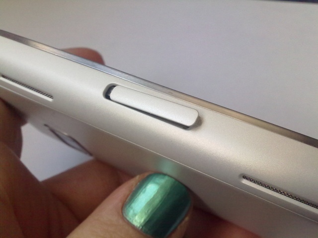
On the opposite long edge to the volume buttons are the speakers – one at the top and one at the bottom. I like this positioning, both of them are on the left long spine of the X6. This makes little difference when the phone is thrown on the kitchen worktop as I bake another masterpiece (really? - Vikki Spence), but the benefit becomes clear when you watch video on the 16:9 ratio screen, you've got yourself some stereo separation for the latest feature film (or in my case Question Time on the BBC iPlayer). They're also a substantial set of speakers for such a small unit. You won't get high fidelity from them, but you will get enough noise to fill a hotel room as you get ready in the morning. That'll do for me.
One problem with the diagonal styling on the top of the unit is around the 3.5mm headphone socket. Because the socket is at right angles to the screen, but the plastic moulding around it carries the angle. With certain cables that need to fit flush, they're pushed very slightly out of the socket, which is just enough in some cases to cause connection problems, especially for audio playback.
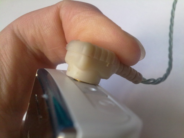
Plugging in a generic peripheral to the socket and you're asked to confirm what you've just put in... every time. A default setting here would be nice. What would also be nice is if the Music Player paused when something is removed from the headphone socket, or at least have another option to set this, because it's really useful. Of course a certain company already does this – and if Nokia were to add this usability feature would they be hit with another patent/copying lawsuit? Who knows, but I wish they would take the chance.
The X6, once it gets into the supply chai,n either on a hugely subsidised contract or in a version which removes the Comes with Music addition and brings the SIM free price into the 'disposable' range, should be a popular phone. And anything that makes the X6 punch above its RRP is to be welcomed. That's why some of these styling faults are going to be disproportionately punishing on the fortunes of the X6. People don't want to be seen with a 'cheap' phone; and the little niggles in the construction detailed above move the X6 away from 'stylish' to 'tacky.' It's not insurmountable – the screen and front style is lush and modern, but someone needs to get a grip in the factory and break some knuckles before the X6 breaks too many hearts on the High Street.
-- Ewan Spence, January 2010.
In part two, I'll look at the music part of the X6, and if the device (and Comes With Music) actually delivers in this smartphone.
Reviewed by Ewan Spence at

