Review: Nokia N81 pt 1 - The hardware, the naviwheel, the carousel
Score:
82%
The N81 8GB, Nokia’s latest Nseries music phone, at first sight, looks aggressive. A moulded black casing that shines like Darth Vader after a waxing; harsh gunmetal encircling the device; the glowing white keys reminiscent of a pulp Doomsday machine. Put them all together and you realise that this device means business.
We’re sitting on 8GB of storage space on this device. There’s onboard wi-fi and high speed (3G) data to stay connected. The software includes the updated music and podcast applications; the interface into the N-Gage Gaming System is here; as are the social networking/Ovi application panes (a.k.a. multimedia menu) …
It’s when you step away from the gap that Nokia have placed this in – the music and entertainment space – that you realise that some of the compromises made are going to ensure the N95 stays at the top of the heap as the best all rounder, but you’ll be also able to make a strong argument that the N81 is a great lifestyle device for those looking for mobile entertainment.

More than the N95, the N81 is going be squaring off against the iPhone in the mind of many. And that’s mainly because both devices are supremely good at consuming Web 2.0 content; they’re not so great at creating the content. The N81 comes with the standard Nokia 2 megapixel camera and plastic lens. It’s a similar camera to that on the E61i, and follows the same specs as the previous ‘music phone’, the N91. We’re also missing the GPS that the N95 carries, and our review unit didn’t feature Quickoffice viewers.
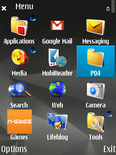
What we do get is the beginnings of the new ‘Social Internet’ lurking under the multimedia button on the pad, and the new version of that menu. Yes, it’s yet another way to get to your information and open applications. By my count that makes four major ways of launching a single application in S60 (the shortcuts, the soft-keys on the home screen, the applications screen and the multimedia menu) and this is the big flaw in the N81 (and S60 as a whole) – the user interface is cluttered, laid out poorly and has no consistency. Oh, and the application count on a fresh install presented to a new user? 57 application icons and 5 separate sub-folders. How is anyone meant to find anything in here?
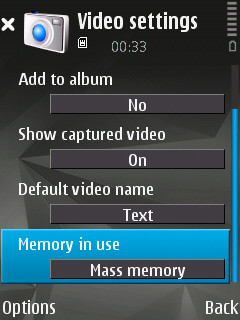
And the mysteries of S60 continue… I still have to choose between ‘mass memory’ or ‘phone storage’ when I take a picture? Now I know, thanks to my knowledge of how the N81 8GB works under the hood, that this is down to how the 8GB is created by using an internal memory card, but is the regular end-user, which is who this phone is squarely aimed at, going to get this, or just be horribly confused? Be honest, having to choose between two internal memory 'disks' is a kludge and should have been caught by the UI testers much earlier. Why does the user have to deal with a phone with 8GB of memory giving you the choice of which disk to put things on? That should be the job of S60.
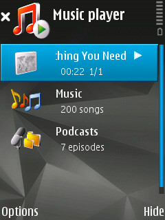
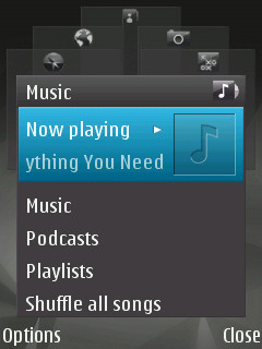
But let’s look at the ‘new’ UI elements with which Nokia hope to make the N81 stand out. The improved music player and podcast application, I’ll cover in detail in part two; so I’m looking here at the new Multimedia launcher, the new keyboard layout and functionality – which are closely tied together.
One of the good losses on the N81 keypad is the ‘pencil’ key. This depreciation reduces the keys on any device and makes it less scary. While the feature it had (switching between entry modes and special characters) has always been duplicated by the ‘1’ and ‘#’ key when entering text, the loss of this key has also pushed the highlight text and items to the # (hash) key. Congrats to whoever got this on board for the Nseries range – it’s already been done on mid-range S60 devices (such as the 6290); it reduces the build cost on the device (one less switch) and it makes it clearer how to do things for the end users.
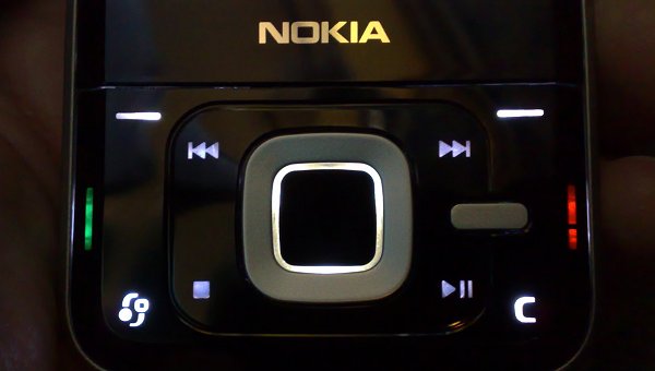
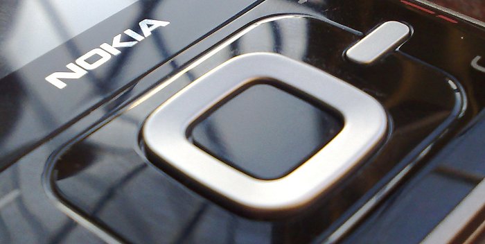
The newest innovation is around the square d-pad. By this I don’t mean the very welcome direct keys for music playback, but in the 'naviwheel' (scroll wheel). Which doesn’t actually scroll, and isn’t a wheel, so should get round any legal niceties when compared to an iPod. It’s a good addition to the UI, and allows you to work through a long list of musical tracks with ease by running your thumb or finger around the silver cursor ring to control the on screen selector. This is picked up in hardware, and in essence works as if you are spinning the cursor ring with your fingers.
It’s not incredibly precise. Sometimes you start scrolling straight away, sometimes it takes a little movement to get going, and part of me thinks that for a first effort it’s well done – it does feel incredibly cool and futuristic – but part of me thinks that a company of Nokia’s size should be able to get this right before delivering the phone to the public. There’s an argument that this is just a bedding in process and over time I’ll get used to the pressure required to activate the scroll – I’ll let you know in the final piece of the article after using the device in anger for two weeks or so.
What I hope a firmware update will clear up with the scroll wheel, is to make it work in any application that has a list. I’m not sure how you can explain why the wheel works in the multimedia launcher, but not with your list of names in the Contacts application. All the good work has been undone because of the lack of consistency in where the naviwheel works. It should be everywhere or nowhere in my opinion. And, as Steve has noted, the naviwheel is turned OFF by default, which is utterly bizarre - Nokia, please note!
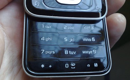
The styling of the device and the main numeric keypad is an interesting one. I know that Steve, in his 'first thoughts' article, was very critical of these keys, and I have to say that on first glance the do look like a last minute design idea, a flat pad covering the microswitches (much like the Sony Ericsson W950), with very basic white etchings marking the keys. But in use it’s very easy to use. There are horizontal ridges between each key, and a slightly wider ridge to signify where the centre keys are. As I’m used to sliding my thumb over the keypad while texting, this is a wonderfully fluid movement, and allows me to be one of those super-fast (T9 using) texters. A far cry from the physical calculator style keys on the N91.
The less said about the screen the better. It’s very reflective, almost useless in direct sunshine (shades of the N76 - grrrr) and gathers finger smudges and ear grease more than any other smartphone I’ve used in recent months. Side by side, the recessed N95 screen stays cleaner, looks clearer outside, and I’d say the N81 is a step backwards compared to other Nseries devices.
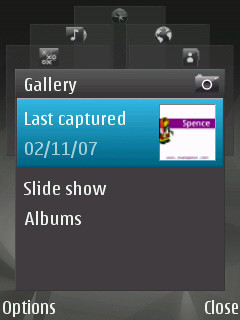
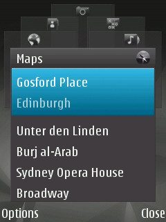
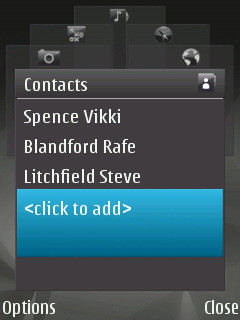
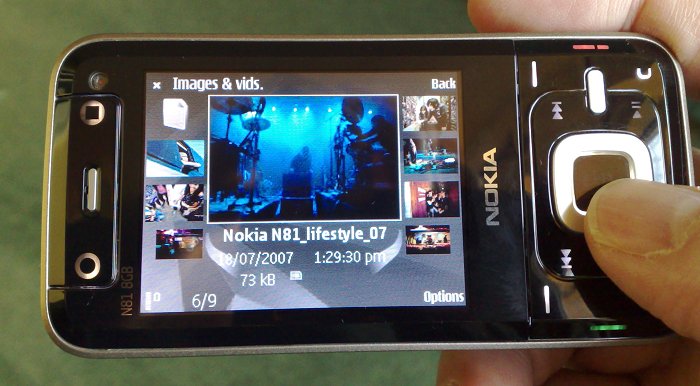
Onto the Multimedia key and its application launcher, which is accessed by the one-touch button on the right of the device. Much like the ‘music’ button on the N91, this is the gateway to the new features on the N81 that Nokia will be populating in the months to come. What we have is a series of graphical cascading windows (tiles) that can be scrolled through to access the major areas of media and entertainment on the device. This gives you access to the music application; the video and picture gallery; a list of your favourite contacts; web site bookmarks; your favoured locations in the Nokia mapping application (still present, although you’ll need a third party GPS to make full use); and the N-Gage gaming suite.
The new N-Gage Gaming suite is delayed until December, so we’ll take a more detailed look at this nearer the time, and I’ll deal with music as a whole in the next part of the review. Mapping, of course, is one part of Nokia’s social software roadmap using the Ovi internet strategy, announced at the Go:Play event in September. Bringing all these applications under the single button is a smart move, but again it leaves the user wondering just what the best way to get to an application is? Do you dial your Mum from Contacts or from a speed dial slot or (more longwinded) open up the multimedia menu, spin to the separate contacts list, and scroll down to get to the same number (assuming you'd remembered to add her here in the first place)?
For this new launcher to work, the Ovi concept is going to have to be tightly integrated, useful, and more than a collection of shortcuts to built in applications or the web browser. It needs to be seamless in every area – and the early signs are promising. Saving a location in Nokia Maps does add it to the Map tile in the multimedia menu, but a speed dial or new entry in Contacts isn’t – to be seamless I would hope that in the Contacts application there’s a menu option to add a name to the Contacts tile. That sort of seamless thinking is needed.
Looking back over the first part of this review, there seems to be a lot to criticise in the N81, but you should be paying attention that most of the faults here are either due to inconsistencies in the user interface, or are smaller errors that could easily be corrected in a firmware update. In terms of hardware, the N81 is a pretty solid device, well built, and the slider has a satisfying ‘clunk click’ positive action.
Over the next few parts, I’ll be looking at the N81 as a music device, how well it handles in day to day use, and my overall thoughts of the device.
Ewan Spence
Reviewed by Ewan Spence at