Review: Motorola Z10 - Part 1 - Design, Form and Function
Ewan takes a look at the UIQ3-based MOTO Z10. In part one, a look at the hardware, style and design of the unit.
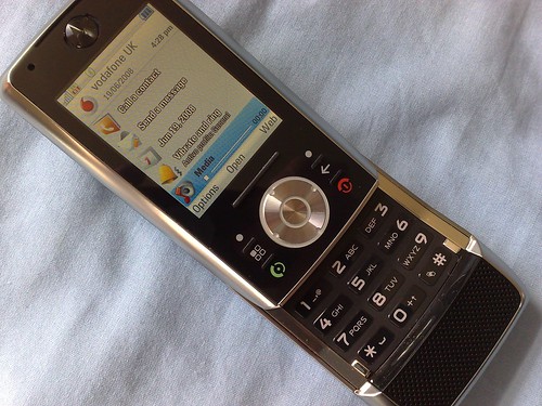
The Motorola Z10 certainly looks like an aggressive phone. Lots of silver metal, a black reflective plastic front, and the return of the banana slider form factor that was introduced in the Z8. I don’t think that the inclusion of a speaker grille that wouldn’t look out of place in a 1970’s Ford Cortina necessarily spoils the look and feel of this phone at all. It screams “I should belong to man who wears aftershave, opens bottles with his teeth, and can make a pub stop just by walking in the door.”

Of course, men like that usually have some strange weaknesses, like being afraid of poodles, and the Z10 also carries a number of gotchas that make you think twice about the phone. But if you keep them hidden away (i.e. don’t go near them or don’t care about them) then the Z10 is a pretty smart choice for the busy business user looking for something a bit different.
The Look, That Hinge, and all the Buttons
Let’s start with that form factor. The phone’s screen and front fascia buttons slide up to reveal the keypad, and a slight hinging on the back of the unit lifts up the screen angle compared to the keypad. Coupled with the bulge of the speakerphone grille (and presumably with the microphone behind it as well), this creates a really nice shape to the phone, bending in towards your mouth when held up to take a call.
It’s a striking touch, and continues to raise eyebrows when I use it in public.

I’m not so sure about the rest of the keys though. Let’s start with the fascia keys. On first glance, and using intuition (yes, sometimes I have some), there’s a cursor circle and central key, a big plastic key above it, and two on either side. This is in fact, totally wrong.
These raised lines aren’t super slim keys, but dividers – the actual keys are below the surface of the plastic, between these lines. There are in fact six keys around the cursor, not four. It’s an interesting approach, and the raised sections do help to differentiate where to press, but it just looks and feels weird. Hitting the keys on the top and the bottom is guaranteed every time, but the accuracy of the centre keys (which represent the Applications launcher and Back button) is a little bit more hit and miss. Large fingered users may find it’s still easily possible to hit two keys at once – with the call/hangup buttons close by the d-pad I certainly had some moments of being taken back to the home screen a number of times.
The numerical keypad looks great; in action, perhaps a little less so. It again feels like a plastic construction that you push down directly onto the circuit board, but by raising each key in its own sculpted place, it is easy to see where one starts and the other ends. But there’s not enough tactile difference between the keys, so operating by touch isn’t an option. And with a lot of the weight of the Z10 above the keypad, holding it one handed to give your thumb the best range of movement leaves the phone feeling precariously balanced in your hand.
And I know it’s a little thing, and I know it’s because of the time I’ve spent on other smartphones (specifically from Finland), but having to remember the space button is the ‘*’ key and not the ‘0’ key is catching me out every time I start to write any text. And do we really need the call log on the ‘#’ key as a dedicated function when not dialling? Can’t I configure this myself to something more useful and popular to me (like, say, the Java Twitter client, Twibble)?
The long edges of the device hold the remaining buttons. Down the left we have the media playback keys (which double as the volume keys or playing back your media as required), and a slot for a microSD card. On the other side is a camera button and USB port. Pay close attention to the USB port, because you’ll be charging through this, using a headset through this, connecting to a PC through this, and even listening to your music files through this. In keeping the build cost down, Motorola are jamming a lot of major I/O features through this port. Not having a separate charging point feels like a cheat – I can arguably live with the other elements going through here, but charging should be separate in my opinion. [My take on this, charging's OK via USB but there should be a 3.5mm stereo audio jack - Ed (Steve)]
Of Home Screens and App Launchers
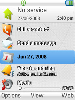
The home screen (or stand-by screen, or active waiting screen, I’m sure the Motorola PR dept will be along to tell me the exact term shortly) clearly puts the Z10 on a ‘function’ footing. There are no little toys to play with, or collections of icons, but instead a clear menu of the most popular functions so you can access them straight away. Those functions are: make a call (naturally), send a message, open the calendar, change your profile, or control the media file (such as music) that you might be playing.
They’re all good functions, but whether they’re the most popular remains to be seen in use. Certainly, quick access to a profile changer is good, and all the functions are well used. I suspect that for the users of this phone, they will be popular – it’s just that I always like to see a bit more customisation potential in a phone. All the Z10 home screen has in the way of choice is the ability to change the application called up by the right soft key. So you can point to just one favourite application.
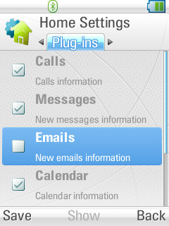
In the programmers' defence, the home screen can accept plug-ins, and the configuration menu allows you to add to the displayed choices, but the only one not active out the box is an email inbox viewer. Hopefully this is something third party developers can pick up and add to.
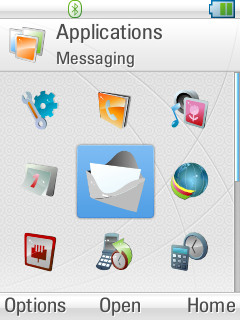
The application screen will be familiar to UIQ users, with your phone’s status at the top (battery, signal, Bluetooth connection icon, etc), followed by the captions and then the program icons. It’s all pretty much a standard UIQ interface, with an understated palette of pastel colour driving the desktop and icons. It’s a nice balance to the masculinity of the casing on the Z10.
Another nice touch on the Z10 compared to the ‘default’ UIQ (that’s normally seen on UIQ3 phones from Sony Ericsson) is the ability to move the icons around the screen and into folders. Now it’s not perfect, you can only move icons into other folders, but they will stay listed in reverse order – so the last icon in goes to the top left. Given time, you can sort out sub folders to your own liking. You can even move the built in applications around. The upshot of this is that if you shove all the icons in a dummy folder, you can move them back up to the root folder in your own order.
Finally we can organise our icons on UIQ3, after a fashion.
The final point to take note of here is the task manager – holding down the app key will bring up a list of all the running tasks, in a similar way to S60 devices, but with a full screen width menu rather than a pop-up window of icons. There’s no 'close app' function here, it is purely a 'jump to another task', but it does the job, and really we all know that smartphones work best when you don’t keep shutting down constantly used applications.
Summary
Overall, the appearance and initial feel of the Z10 is of a good phone. It feels solid, yet relatively light. It looks stylish (but it really does attract fingerprints on the rear of the device), and the slider mechanism is still one of the best designed in recent memory. Yes, the fascia keys might be a touch bewildering as you start, but on balance you can't criticise the look and feel of the Z10.
-- Ewan Spence, June 2008
Next, I’ll be looking at the built in applications, PIM suite and other software on the Z10. I'll then tackle music and media functions in part 3 and I'm hoping I can persuade Steve to take the Z10 on for part 4, in dealing with its rather good camera.
Reviewed by Ewan Spence at