Review: Motorola RIZR Z8 Review (part 1: Design, Hardware and UI)
Introduction
The Motorola RIZR Z8, termed the ‘multimedia monster’ by Ed Zander (CEO of Motorola), is one of this year's stand out handsets. The Z8 is an intriguing mix of high style and high tech, marrying good, though not top end, specifications with a stand-out design.
Running on UIQ 3.1 on top of Symbian 9.2, it has a state of the art smartphone software platform and is the first ever non-touchscreen UIQ phone. However, this is only part of its appeal, since in its positioning and marketing the Z8 moves away from the traditional smartphone offering and instead attempts to create a compelling, consumer focused, multimedia experience, led by stellar video features.

The Z8 is the first Symbian OS phone from Motorola since the A1010 (released as the M1000 in Japan), which was announced at 3GSM in 2005. This is a significant gap and during most of 2005 and 2006 the majority of people assumed Motorola had abandoned Symbian. The news of the Z8 at 3GSM in 2007 was a surprise to many. It also represented something of a shift in strategy for Motorola. Previous Motorola UIQ phones has been aimed at small market niches for specific operators (the A920, A925 and A1000 were only widely available on the 3 network). Their pen-based input and large size limited the addressable market.
The Z8, by contrast, while still a high end phone, is aimed at a much larger market. It is a style conscious, video-focussed multimedia phone (you’ll not hear the word smartphone mentioned in the marketing). With its smaller size and one-handed usage model, it is much more attractive to the general consumer. The Z8 represents a renewed effort by Motorola to enter the lucrative high end European market and it is likely the first in a family of products. As such, strategically, it is a very important product for Motorola.
In this multi-part review we’ll take an in-depth look at this unique Symbian OS-based phone.
Design and hardware
The first thing you notice about the Z8 is its distinctive design. Its kick-slider form factor (which gives the Z8 its 'banana' nick name), which sees the phone bend as you open the slide, is unique. Motorola says that this is intended to help shape the phone to your face and it is true that it does this, but, honestly, I think it is just as much about having an innovative design that stands out.
The first few times you see the opening action, it looks like the phone has broken, and it certainly attracts a lot of attention. I thought it might prove to be a bit fragile, but the mechanism seems well built and it should stand up to day to day use.

The all black casing with yellow coloured highlights is also effective. The bright yellow colour may not appeal to all, but I imagine there’ll be a number of colour variants available before too long (a white version has already been seen in various presentations). The casing is made of hard, high quality plastic based materials. There is a rubbery, black material on the sides and back with some shiny, metallic silver plastic highlights surrounding the 2 megapixel camera and accompanying LED flash. One side of the surround clips off to reveal the SIM card slot; the Z8 is unusual in that you can switch SIM cards without removing the phone's battery (although a reboot is still needed if you switch SIM cards).


On the front, there’s a glossy flat face surrounding the main screen with a small VGA camera for video calling on the upper left. As with many other style conscious phones, the Z8 will need intermittent cleaning to keep it looking at its best because both the front face and the camera surround tend to attract fingerprints.
When closed, the usual control keys are present, including central directional controls, left and right hardware softkeys, a home key, a cancel key and the typical call and end-call buttons. The directional control is a single piece four-way key with a central action button. The rest of the keys are all flush with surface, but there’s distinction between them thanks to small rubber ridges separating the keys. The keys are on the small side and don’t offer the definition of separate stand out keys, but they do have good tactile feedback. They do contrast with the keys used on typical Nokia and Sony Ericsson phones, but are typical of the flat keypads found on other lesser Motorola phones.


It is a similar story on the full keypad which is accessed by opening the slider. The keypad is a little cramped, with the top and bottom row of keys being hemmed in by the surrounds. The keys have a shiny plastic finish and initially felt a little slippery and needed firm presses, but, as is typical with keypads, ease of use improves with familiarity. On the plus side, there's good backlighting, which together with the fantastic screen, makes night use very easy. Overall the keys and controls are a little disappointing, but performance is acceptable given the necessary design compromises.
On the left hand side of the device, there’s a dedicated video calling button (a bit useless most of the time), together with dedicated volume controls, which intelligently switch between controlling call volume and multimedia volume depending on the context. Below these buttons is the microSD card slot; the Z8 includes support for SDHC (current capacity is 4GB, but more in the future).


The camera capture key and multimedia key are on right side of the device, along with the miniUSB port, which is used for both PC connectivity and charging the device. The multimedia key starts the Media Library application, or if music playback is active, will act as a pause/play button. ‘Fast’ charging happens with the dedicated charger; while charging via a PC/USB port is also supported, albeit in ‘slow’ mode. The phone supports 'Mass Storage' (i.e. view as a drive on a PC), 'PC Connect' and 'Modem' modes. The port has a slightly flimsy cover, which may not last, thanks to the dual charging/PC connectivity roles.
Overall, I think the design is very effective and, while attractiveness is subjective, the Z8 will definitely turn heads. On the flip side, creating a small and attractive design does result in some compromises, both in specifications and in usability, but in general I feel that there is a good level of compromise between looking stylish and practical ease of use.
An attractive aspect of the Z8, related to the design, is the level of intelligent integration between the hardware and the software, such as that found in the volume buttons, in the multimedia hardware keys and the ability to switch SIM cards on the fly. There’s also the expected automatic answering when you open the slide, but the best example is with the camera functionality. The camera is activated via the camera capture button; in slide closed mode the screen switches to landscape mode and the rear camera is used, in slide open mode the screen switches to portrait and the front camera is used. This demonstrates good attention to detail and, while some may find this a limitation, I think it showcases careful thinking about how the phone will be used.

The 2.2 inch, QVGA, 16 million colour screen is the hardware highlight of the Z8. It provides bright and vibrant pictures with much greater depth and saturation than many other mobile device screens. Outside, the available viewing angle is much reduced, but is easily viewable in all but the very brightest conditions.
With quad-band GSM, 2100 MHz WCDMA and HSDPA support, the Z8 has good cellular connectivity. The 3G bands are European only, but since the Z8 is only going to be officially made available in Europe and Asia, this is not a major concern. Motorola have not ruled out a US variant, but there’s no definitive news. Bluetooth is available for local connectivity and there is full support for stereo audio in the form of A2DP and AVRCP profiles.
User Interface
As the first non-touchscreen UIQ phone a lot of the attention around the Z8 has focused on the UI and its implementation. It is difficult to fully cover a UI in a review as different aspects are important to different people, but hopefully you'll gain a good sense of the flavour below and you'll continue to see examples from the UI in the rest of the reviews in this series.
General
In contrast to previous UIQ devices, the Z8 uses 'softkeys' (rather than touch) for interacting with the user interface. Most of the time there are three softkeys displayed on screen, the left softkey (operated with the left function button) is used to either access a context sensitive (Options) menu or for positive actions (Yes, Select, etc.) while the right softkey (the right function button, etc.) is generally used for negative actions (No, Cancel, Back, etc.), while the central softkey or action key (d-pad 'in') is usually assigned to the most common action (Open, View, Reply etc.) The context sensitive menus are used to access richer functionality.
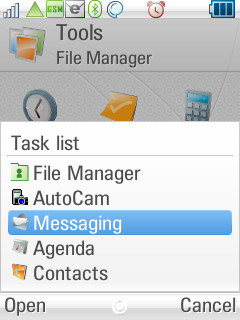
The main UI shell of the Z8 has two parts, the home screen and the application launcher. The home key is used to switch back and forth between these at any time (as with the familiar S60). A long press on the home key brings up the task list which shows the last five applications used.


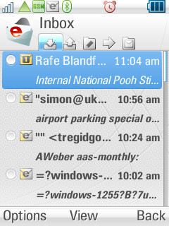
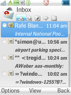
The home screen/idle/standby screen on the Z8 is made up of a series of modules, each accessing specific device functionality – contacts, SMS, e-mail, calendar, profiles and music. Five of these, on a user configurable basis, can be displayed at any one time. Much of the functionality of these modules can also be accessed via the Options menu.
The modules are not static, changing to reflect different context and alerts. The SMS and email modules will, by default, offer a ‘send message’ shortcut, but if new messages have been received then it will show these. If just one message has been received, it shows both the sender and the text, if multiple messages have been received it shows the number of messages and the senders in a scrolling secondary line of text. Similarly, the Calendar module offers new entries or a shortcut to view today’s entries respectively. The music/media module offers a shortcut to the media gallery or displays the current track title and artist, along with a play progress bar.


These modules represent the most commonly used functions and offer an effective shortcut to basic use. It is likely that additional modules could be made available either by Motorola or possibly by third parties – perhaps ones for an RSS feed, for example.
The application launcher lists the available applications in either a grid (3 x 3 on screen) or a list (8 on screen). Folders are supported (but only one level deep) and applications can be moved between folders, but cannot be rearranged within folders. This launcher approach is tried and tested, but can be cumbersome when accessing less frequently used applications in large subfolders. Unfortunately, on the Z8 there are no number linked shortcuts, matched to the 3 x 3 grid, as there are on other platforms.


Zoom
The Z8’s UI has three level of zoom, 'small', 'medium' and 'large', which are available in most applications. However, the zoom only increases or decreases the font size and not the UI building blocks. This means, for example, that the same number of items in a list are displayed on screen at each zoom level, as is illustrated in the screenshots below.

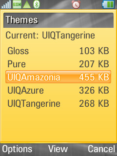
Themes and customization
UIQ 3 has excellent support for themes. It is possible to customize the look of almost all graphical UI elements and there is also support for sounds and icons to be changed. Themes (.utz files) can easily be installed by end users. I would also expect a number of operators to take advantage of this, to strongly brand their Z8 variants.


Settings and Profiles
One area in which I felt the Z8 did very well, was in the organization of device and application settings. General application settings are accessible in the 'Control Panel' folder of the application launcher as small applets, but can also be accessed directly via the 'Settings' entry in the menu of the respective application. This dual system gives the benefit of in-application settings while maintaining a logical, easy to use, central system for all settings.


Another strong area for the Z8 is its Profiles support (a first for a UIQ 3 phone), the configuration of which can be accessed via 'Control panel' or the homescreen. There are five default profiles, but you can edit these or add your own. There is an impressively comprehensive level of control, with screen settings (brightness, screen saver), alarm settings (on/off, sound used), individual sound settings for each message and call type, kill filter (allow list) and theme selection along, with the usual call settings (style, volume).


For text input the Z8 offers the usual multi-tap option, but also offers iTap for speedier predictive text input. iTap is Motorola’s version of T9, it offers similar intelligent word recognition based on a series of single key presses, but, additionally, also offers context sensitive word auto-completion.
In some circumstances I found that, after typing the full word, iTap didn’t offer me the right choice. Instead it was necessary to lock on to the word as I typed. However, this is offset by correct word completion – something T9 does not offer. iTap works in conjunction with the direction keys – up and down scroll through the possible words while pressing right accepts the auto-completion of a word; to help make this clearer on screen, small red arrows indicate the possible options, while the auto-completion is displayed in a different colour, as illustrated in the screenshots below.


iTap’s auto-completion is context sensitive; it examines the previous words in order to work out the most likely next word. It also learns custom words as you enter them, this can be quite helpful – for example it will be able to auto-complete some domain URLs if you have previously entered them.
iTap can be switched on and off at a system level or selectively, by pressing the hash key, which cycles through the input methods at any text entry point. It is difficult to say whether iTap is better or worse than T9. While iTap does offer extra features which can give it a speed advantage in certain situations, it is not as simple as T9 and requires more attention from the user.
UI Discussion and UIQ 3 significance
Fears that the Z8’s softkey style of UIQ would be compromised by its touch based ancestry are completely unfounded. The softkey style works very well and, while it is reminiscent of S60 and Windows Mobile Classic (there are, after all, only so many softkey variations possible), it does have its own distinct flavour too.
If you are an existing UIQ touchscreen user then you may notice a few omissions; 'Task manager' is much more limited and there’s no universal shortcut menu at the top left of the screen. Obviously the data input options are more limited and some actions take a little longer as you need to navigate menus and the like, one step at a time.
There’s always going to be a debate as to which way is best: touch, softkey or something in between. The truth is that different styles of interaction suit different people and different situations. Now, for the UIQ platform at least, you can choose your preferred option. With the Z8, UIQ 3 proves it can work for both softkey and touch implementations. This is not only a significant achievement; it is also a significant advantage over its competition. While most consumers will not care about this as such, it is very important to developers (able to target more phones), phone manufacturers (reduce development costs) and operators (reduce integration costs and time to market).
UIQ 3 was a very significant software platform update; it added support for multiple input mechanisms and UI configurations from one code base (in simpler terms, it supported both touchscreen and non-touchscreen phones). Phone manufacturers can use a single platform to create a broader family of phones than was possible before. Developers can write applications which will run on both touchscreen and non-touchscreen phones from a single binary file. It was the first platform to achieve this milestone (S60 and Windows Mobile are still working on this).
This means that, despite being the first non-touch screen UIQ phone, the Z8 already has a library of third party software it can draw on. You can take a single application SIS file and can install it on both the Z8 and a Sony Ericsson UIQ phone and see the same application running optimized to the environment on each phone. Although in practice, as I’ll discuss in a later review part, not all current applications function correctly, but the theory is sound.


So how well does UIQ's non-touchscreen flavour work? 'Impressively' is the short answer. Crucially, the overall speed of menus and transitions is good, the general layout of menus and settings is logical, and there’s a rich level of functionality. The UI is largely intuitive, although, as with all new platforms, there’s something of a learning curve. Of course there is room for improvements in places, but the overall impression is positive.
The speed and stability are particularly impressive when you note that this is the first phone of its type and its performance is in stark contrast to the early releases of Sony Ericsson’s UIQ 3-powered P990. Motorola have also added some intelligent custom touches, the most obvious being the home screen and hardware integration.
Part 2 of my Z8 review will focus on its applications, part 3 on its multimedia and part 4 on summarising the overall package.
Rafe Blandford, All About Symbian, 25 June 2007


The Z8 compared against the Nokia N95 (right) and Sony Ericsson M600i (left).
Despite the fact they appear similar in size it is worth noting that the Z8 is, in fact,
quite a bit smaller than these two handsets as illustrated below.


Comparing devices thickness: M600, N95, Z8 and Sendo X (left) and Banana and Z8 (right).
Reviewed by Rafe Blandford at