Review: Grid
Score:
65%
Just as Symbian users start to get used to having multiple home screens, OffScreen come along with an app to completely replace the home screen. Making use of Symbian^3's graphics acceleration, Grid is a super app-grid application, allowing for drag and drop configuration so you can have your apps where you want them. Read on to find out whether I think this puts a whole new spin on the Symbian user experience or whether it's all shine without substance.
Version Reviewed: 1.0
Buy Link | Download / Information Link
OffScreen are well known in the Ovi sphere for making countless utility and novelty applications. With Grid they're presenting something much more powerful and aspirational. It comes at an interesting time when there's more attention and development than ever in the mobile user interface field.
Grid offers a reworking of Symbian's app-grid user interface, completely doing away with any sort of widgets. If you were to adopt Grid as your new home screen application, you would be giving up any direct control over your device. This is a massive shift for anyone used to idea of customisable home screens which provide active information and device controls to the user. Instead, Grid offers an experience much more like that of iOS which is just an app-grid, rather than a traditional type of home screen.
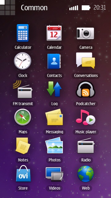
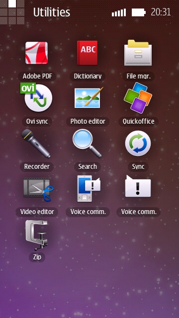
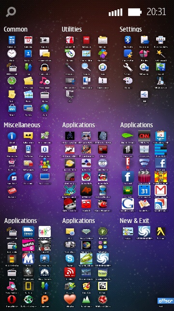
Let's do some counting - The standard Symbian app-grid displays twelve icons per screen (three by four in portrait), with each screen being a sub-folder of the one before it. Per screen, Grid offers an impressive eighteen application icons. Grid has nine screens like that, arranged in a three by three ... erm ... grid!
Thanks to the graphics acceleration in Symbian^3, Grid can quickly zoom from a single app-grid screen to the whole three by three super grid of all nine screens. Zooming out is achieved by tapping the miniture grid in the top left corner. That graphic also serves as a map while zoomed in, highlighting the corresponding square to remind you where you are on the super-grid. Oddly, Grid doesn't support a landscape view, it is locked to portrait mode.
While zoomed into a single screen, swiping across the screen vertically or horizontally will make the application scroll across to adjacent screen. I'd describe the scrolling effect as faux kinetic. Also, there's no diagonal or free style scrolling, you can only move up, down, left or right. However, the scrolling wraps around. E.g. Trying to go above the top row, takes you to the bottom row. This is good, but does take a level of mental gymnastics to work out the shortest route from point A to point B.
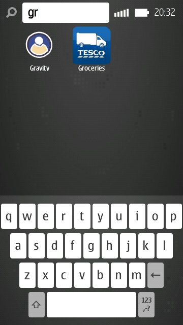
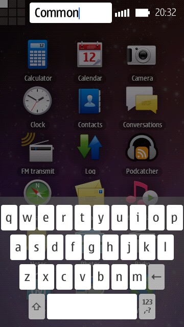
Each screen can be renamed, but they start off with default names. When Grid first runs, all the screens are automatically populated. Depending how many applications you have installed, it could take you a while to mentally map out what's where. Given that there are eighteen icons per screen, and nine screens, finding a specific application can be like finding the proverbial needle in a haystack. Fortunately though, along the status bar at the top of the screen, there is a search icon, which you can tap to type in the name of what you're looking for. Typing in search queries is achieved with a bespoke portrait QWERTY keyboard. This same keyboard is used for the aforementioned renaming of screens, which is activated via a long press on each screen name.
Being able to zoom out and see an overview of all the applications you have installed, (albeit with each icon being tiny) is an interesting view on application management. Some people might even find it possible to find the application they're looking for from high altitude. However, I do wonder whether this view on applications might be somewhat overwhelming, and since there's a way to type in an application name, what's the need for scrolling around?
Despite applications being initially placed automatically, the user can move them around, to organise them as they wish. In a very Android-like way, a long press on an icon makes it appear larger. It can then be dragged to a new position on the same screen or to a completely different screen. This is one area where I have a major usability gripe with Grid. Dragging to other screens are limited to the same movements as the ordinary navigation, i.e. in four directions. Therefore, an extended drag maybe called for to move an application between two distant points.
It's understandable that the developers of Grid wanted to stick to the metaphor of a two dimensional space where the user can pick up and drag objects. However, I do not think that this metaphor scales well in Grid. In theory, Grid can support up to 162 icons. If a user wanted to get serious with Grid by rearranging everything into their own taxonomy, that is a LOT of dragging around. A shortcut is needed along the lines of 'Send this icon over there', or at least a way of selecting and dragging multiple icons.
As it is, Grid can be overwhelming to get set up for serious use, even more so when one considers that the whole process would have to be repeated any time the phone had to be reset or replaced. To be fair, Grid does what it does very well, and has all the graphical polish that you could want. However, I suspect that the underlying design issues possibly relegate it to being a novelty application, rather than a serious alternative to the default home screen.
Grid is available in the Ovi Store, free of charge.
David Gilson for All About Symbian, 10th January 2010.
Reviewed by David Gilson at